Five years of plasticbag.org – it has passed in a flash. It’s seen me move from temp jobs, through journalism school to more temp jobs, from multiple roles at Time Out, to working at emap, designing UpMyStreet Conversations (among others) and doing R&D work for the BBC. The last five years has seen webloggia change from a couple of hundred dorks mucking around on the internet to a few million dorks mucking around on the internet and being talked about a conferences. It’s seen the world go from millennial angst to millennial hope, only to see 9/11 happen and our countries declare war on Afghanistan and Iraq. In my personal life I’ve lived in three major homes, stayed on innumerable floors and been to America a fair few times. I’ve moved from writing about stuff on the web to stuff in my life and back to stuff on the web again and had a small but statistically significant number of particularly disasterous relationships. God knows if I can manage another five years like the last five (I don’t know if I’d be able to survive it to be honest), but if I do I think maybe I’ll be looking for a party to celebrate…
Anyway, a few days ago I put up a dump of every post ever published on plasticbag.org for people to rip apart as they pleased. I thought some people might decide to visualisations or to analyse word frequency or link frequency or whatever. To be honest, I’ve not had the most overwhelming response ever (but then again it’s not like I was giving away free chocolate bars or anything), but I’ve really enjoyed the stuff I have received. I think perhaps the concept would be more appealing and generally useful if (as New Media Hack suggested) more people opened up their archives in a similar style. Still, never mind. Here we go:
Our first batch of analysis comes from Cal Henderson who has basically used the data at his disposal to take the piss out of me. A few weeks ago I got a bit moody with Matt Jones after he complained that I was starting every post I was writing with the word “So…” (here’s the grump in question). So what has Cal done? He’s established the horrible truth of the situation – here’s a graph of how many posts I’ve started with the word “So” over time:
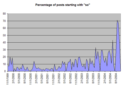
As you can see – a startling indictment and as Cal said to me on AIM, “evidence that you’re getting worse”. More evidence in that direction comes from Tom Carden who sent in three visualisations of increasing complexity. The first diagram is a simple model of posting frequency. The graph is separated into five separate blocks (at the bottom of the diagram) and each day is represented by a vertical line. The stronger the colour of the line, the more posts happened on that day:

As you can see from the visualisation, I really seem to have found my stride towards the end of my first year of weblogging (Nov 1999 to Oct 2000) – and throughout 2001 I’m posting very regularly. 2002 starts slightly more slowly, but then my post-frequency goes through the roof for a while before apparently starting a slow long drift off towards irregularity which flattens off around nine months ago at an almost total absence of posting. (You can see that image at its full resolution here).
Tom’s next step was to try and incorporate into the graph some sense of post length. Which resulted in this diagram (which I’ve distorted slightly to make it easier to explain):

So one clear consequence of me posting less often appears to be that I have – unfortunately – become a bit of a blowhard. Look at how much longer the posts are! (The larger version of this visualisation is here). And when you bring it all together, you get this stunning piece of work:

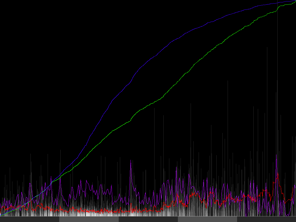
There’s a bigger version of this particularly complicated graph here. The red line indicates a moving average of post length (over 25 posts). That looks like it was fairly solid for the first three years and then suddenly started to get substantially longer towards the beginning of the fourth segment. This coincides with an apparent drop in post-frequency (each post is represented by a vertical grey line, where they overlap they get brighter – you can see this most closely at the bottom of the graph).
You may well ask what it was that caused my post-length to go up and my post frequency to drop so dramatically? Well it turns out, looking at my archives, that this happens at precisely the same time as I switched to using Movable Type instead of Blogger – which just goes to show how much the tool helps dictate the form of your writing online.
The purple line indicates the moving average post length (over a seven day period rather than over 25 posts). This has vacillated a lot over the last five years, but appears to be reaching new lows in the last six-nine months (as well as the occasional odd new high). This is probably a direct result of work pressures. However it doesn’t appear to have had an enormously negative effect – the green line indicates cumulative total of words written on plasticbag.org and – although maybe it’s starting to flatten a little – seems to be an almost totally linear rise over the last five years. The blue line indicates the cumulative total of posts on plasticbag.org however – and that really does appear to have changed quite dramatically. If all these trends continue in the way they seem to be going at the moment, you can look forward to one post a year around the length of a novel. You lucky bastards.
Anyway, that’s your lot – that’s all the visualisations I’ve had in so far. I’m hoping to get a few more from lollygaggers and slugabeds, but in the meantime thank you to Cal and Tom for spending their time so ill-advisedly, and thank you all for being part of my life for more or less of the last five full years. Now I must get back to doing something slightly more useful with my time. xx
14 replies on “Five years of plasticbag.org: The Visualisations”
Visualizing 5 Years of Plasticbag
Tom Coates had some people graph posting patterns through his 5 years of blogging. I guess the move from plenty of short posts to sparser, longer posts, is a trend shared by many long-established blogs. It’s definitely been true for…
So, that was brilliant. Nice work, (2(Tom) + Cal)
Looking at five years of blogging
Tom Coates has an interesting look at his posting patterns over the last five years that he’s been maintaining his weblog. One of the best ways we can try to understand the trends in blogging over time is to look…
Form follows Function
Given that it seems that everyone is using the same 3 or 4 tools to create their sites these days is it any wonder that everything is starting to look the same?
Hmm, *very* interesting.
Perhaps as a step further, it might be quite interesting to do covariate analysis on the intrinsic readability of the blog.
I do recall that there’s a Perl module that computes the Flesch-Kinkaid readability score of a text sample by using the formula:
(11.8 * syllables_per_word) + (0.39 * words_per_sentence) – 15.59
. . . and, theoretically, this ought to reveal how easy it is to read one post, based on the US educational system (i.e. a Flesch-Kinkaid score of 9.0 means that the text can be understood by a 9th grader)
So, I suppose it would be rather interesting to plot this against time and see how the understandability of a blog changes over the ages. Of course, there’s bound to be bias, but judging from the large sample size (4175 posts), it shouldn’t be hard to get a statistically significant result.
Here are two images of the plasticbag dataset, as run through the Phase Space Visualization process popularized by Michael Zalewski.
Image 1
Image 2
This is run through my own tool, called Phentropy, which you can see more output from here. And the new tool I’m using to do the rendering, which is normally used to render MRI’s, is here. Hope this amuses!
–Dan
Hey, you may be interested in downloading the Movable Type Word Count plugin.
I also spread the meme in the Perl community. Curious what the result will be.
I’ve plotted the date of the post across the bottom, versus the time of day that it was made. Midnight is at the top, noon is in the middle of the graph, and so on.
I notice the following:
I got the idea from one of the Edward Tufte books.
I’ve written a perl script, mt-export-analyzer.pl;, which takes plasticbag.txt as input and outputs a CSV analysis with various metrics (such as Fog and Flesch-Kincaid). Suggested modifications include analyzing post titles and showing the permalinks column, as well as fixing several non-critical broken things about the CSV output. This is not “good” code, just effective code. See the graphed results.
Software that encourages flaming
A young up-and-coming researcher named Clay Shirky has just published Flaming and the Design of Social Software, which I think is useful in that it talks about the role software has in creating the culture of a community. In the context of Tom discover…
Accountability and Culture in a Loosely Coupled World
Rebecca talks about finding offensive content on a Technorati tag aggregation page. Besides the usual tension between free speech and community standards (to which I think she’s found a useful balance), the thing that strikes me is how well this demons…
Collaborative Feedburner Stats Project
For the next part of this collaborative project, I’d like to ask Feedburner account
holders to publish their data on the Web in one of the above formats. The idea being that
those analyst pundits amongst us can combine the contributed data to get a …
Good article. Very interesting and useful. Thanks.
HAVANA (AP) ó Photographs of Fidel Castro standing and talking on the phone were published Sunday in Cuba’s state-run media, a day after the ailing leader appeared in a video to dispel rumors he was on his deathbed.
The Communist Youth newspaper Juventud Rebelde dedicated its front page to the Cuban president, printing a blown-up picture of a pensive Castro with the title “Always fighting for something, and fighting with optimism!”