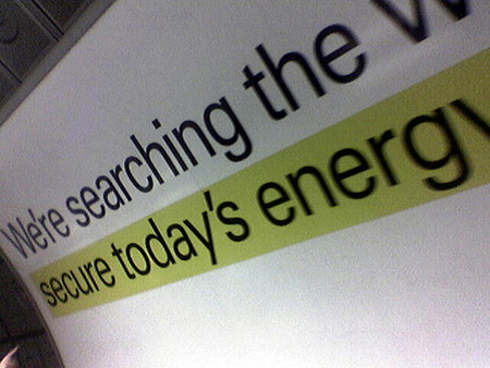
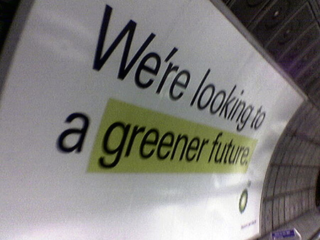
About a month ago I was watching television and an advert for BP appeared and goddam did their new advertising aesthetic look like my site. Now I’m not seriously suggesting that they ripped off the design of my site, but the synchronicity is pretty astonishing – particularly given that plasticbag.org used an exclusively yellow highlight for a few months early on. I tried to take a picture of the TV at the time, with no success (lots of banding and stuff) but last night I was on an escalator in a tube station and stumbled upon a huge block of billboards. And here are the pictures:


So it’s all quite funny and entertaining and everything. We’re clearly all meshed with the same zeitgeist or whatever, but in the spirit of accidental crossovers (particularly given the acronymic similarity between BP and PB.org) and inspired by a comment by Mr Paul Hammond, I’ve remixed their logo in return to make it fit with the various plasticbag.org colour schemes. Maybe I’ll use it as a logo for a while sometime in the future… Hopefully they’ll see the joke and won’t sue me or anything:

20 replies on “BP adverts look just like my site!”
Is it an accident that while BP uses its design to emphasize its green credentials, plasticbag appears to be bigging up its lead (Pb) content…
Shameful to relate, my first thought on seeing those was ‘Ooh, that’s a bit Plasticbagish/2lmc Spoolish’. (Well, second thought after, ‘How can BP have the gall to advertise their touchy-feely eco-credentials?’.)
Whilst I must admire your aggressive land-grab in logo colour-space, four logos with different colour schemes does rather represent a lack of clarity of image – just what is it that you want to say?
Yeah, I found that rather stunning too. There seemed to be something disingenuous about a major oil company using a sunflower as a logo, kind of like a burger joint having a happy cow for it’s branding.
I’ve seen the print ads in North American mags for a few months now. Funny, plasticbag.org was the first thing that sprung to mind when I saw them. Perhaps it’s a “B” thing. =)
yeah, nice theory except playlouder.com has used a yellow highlight for about five years now.
In the States at least, these ads aren’t new… They have been up at least a year. I love BP’s branding. It’s totally hypocritical, but they do a good job convincing American’s at leat to buy more fuel for their big ass cars.
BP CI.
Perhaps if you assured us all your plastic bags were fully recyclable, then BP couldn’t possibly come after you?
Lying oil bastards. They are spending millions of lying ad campaigns while they support the corrupt oil system and the war in Iraq.
The yellow highlights have actually been around for some time. They appeared first in internal communications around 2003, they were also sort of applied to headers in the website redesign in that same year (Sapient design.
I’m not being funny, but there are other creative people in the world that get paid to think of things. Since when has a yellow highlight been original?
I like reading your blog, Tom, but in this instance I think you’re overreacting a little!
Matt. Come on. Please. People tell me that when I do these posts I should just do the statement and not overly explain what I’m on about, but this is precisely why I fill them with clarifiers and qualifications. I couldn’t really have been more clear about this one, surely? The following lines all appear in the original post:
“Now I’m not seriously suggesting that they ripped off the design of my site” / “So it’s all quite funny and entertaining and everything. We’re clearly all meshed with the same zeitgeist or whatever, but in the spirit of accidental crossovers…” / “Hopefully they’ll see the joke”
BP spend about 95% of their adverising budget talking about how green they are. And I suspect they have a big budget.
As for the logo, you know of course that they’d sue you into the ground 🙂
“kind of like a burger joint having a happy cow for it’s branding.”
I’d so eat at that place.
They should steal it back – pb is the symbol for lead in the periodic table…but I guess we’re a few years out of date now that we’ve all gone unleaded.
Hey Tom, I don’t remember how far back, but these ads have been appearing on the NY subway for more than a year, possibly two. Strange, because I still can’t remember where I saw it first, but it has always reminded me of your site…
P.S. Are you ever going to reply to my email of the other week 🙂
Yep, these ads have been running in the USA for about a year.
British Petrolium re-branded themselves as “BP” in the USA, then globally, as it had a lot of negative connotations outside of the UK.
Nice…I came to your site and was trying to figure out what the point of all this highlighting was but looks like its catching on…going to take me some time to get used to it. Good word!
hey come on people. it’s just a yellow highlight. if you say that the ad was a rip off, you might be very wrong! and think about ads where they have black text on white background. i’d say, rip off. or not. cheers.