One small aside that I should probably bring to people’s attention (and get some feedback on) is the new Yahoo! homepage (Yahoo! UK version) which has launched in beta. Richard MacManus of the awesome Read/Write web has a good review of the changes to the page. There are a few little things I’m unsure about, but they’re basically trivial compared to the many significant improvements that have clearly been made. I’m interested to know what everyone else thinks:
10 replies on “Yahoo! launches new beta homepage…”
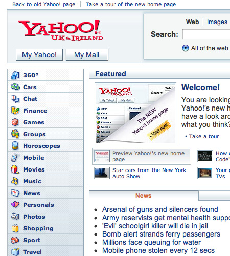
I think Yahoo’s UK News is really, really depressing…
Tom, the US link needs to omit the trailing slash, ie. http://www.yahoo.com/preview or it won’t work.
The UK site seems to support Safari, unlike the USA one. Go British!
That should be fixed now! Thanks for pointing it out…
Although im a Google man myself, i checked out the new yahoo page earlier, and quite liked it! РThe use of Ajax is nicely done, but Im thinking they should of done more in the way of personalisation with it. Ok I know that’s what MyYahoo is for Рbut still would of been nice to incorporate some of those features into the homepage.
> The UK site seems to support Safari, unlike the USA one. Go British!
Up to a point — there are more click-throughs to secondary pages on the UK site than the US, which may have something to do with it. The UK site also seems to have differing behaviours depending on whether or not you’re logged in with a UK-based profile. Chris at the next desk to me is currently getting a weather forecast some 10-15°C lower than me, for example. Bizarre.
There are some great posts on the Yahoo! UI Blog about the new page, and the design patterns they’re using.
Generally, the whole thing looks cleaner and more inviting, and the column of Yahoo! services down the LH side does a better job of promoting the diversity of the company’s portfolio than the old page.
I do prefer the old homepage – icons, colors, and layout does appeal me that much on the new homepage.
Hi Tom,
I make a few comments about the redesign on my blog but admit that Netvibes and Live.com have replaced use of traditional portal entry pages.
That said, what I find very interesting is that Yang and Filo make the marketing of the new design a bit more personal …
From my
blog:
If you visit the redesigned page while it is still playing, be sure to check out the video from co-founders Jerry Yang and David Filo. The two sit on top of a desk and give a very wanna-be funny/friendly intro to the new page and re-introduction to the brand. Filo, characteristically, says nothing.
This part of the Yahoo! brand – the faces behind the name – has been missing for a long time. Whilst Brin and Page have made themselves internet icons and helped add personality to the Google brand, Yahoo! has never really accomplished this.
In the business community, Semel and Braun have fulfilled the role for Yahoo! for quite some time, but it has been absent from their consumer marketing strategy for years. I wonder if this was Semel’s idea. Regardless, consumer trust is heightened when people associate faces to the brand, and I think they should do more of it.
Hope all is well. (We met briefly after the Carson Apps conference a while back. Would be great to sync up …
~G~
I worry about exposing the Y! stuff to the public. This is convenient shorthand for staff, to prevent having yahoo-typing-tourettes, but the it’s a little confusing to outsiders.
And why bother anyway? Do you want your public calling you Y! Isn’t that splitting the brand?
Get it working in Opera or I’ll have no reason to even try and use Yahoo! instead of it’s competitors…..
I don’t care if news is good, or if search is good etc.. if it doesn’t work in my browser of choice.
I stop by yahoo regularly and like the design. Clean and fresh. But Adrian is right, It should be working in Opera.