I’ve been having enormous fun playing with Lastgraph over the last week or so. You tell it your last.fm username and it runs off and plots you a nice colourful graph that visualises your listening behaviour.
I’ve been with last.fm for a very long time (since 2003, when it was still really audioscrobbler) and have scrobbled a good 50,000 tracks. As a result, my graphs are pretty nice. You can get them visualised in various ways, but I would recommend using the ‘rainbow’ style and allowing it even to plot artists that you’ve only played once. That gives you the greatest detail and most beautiful results.
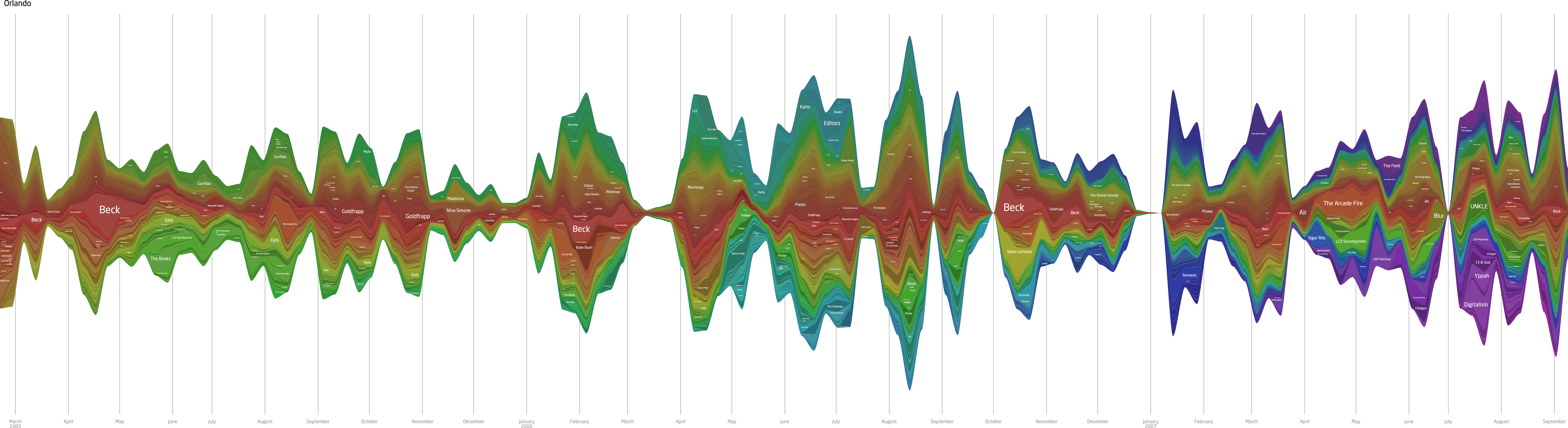
The most important thing about any visualisation is that it should give you another perspective on a dataset you already knew, and these graphs certainly do that. You really can get a sense of what kind of listener you’re dealing with. When you look at mine you’ll see a hell of a lot of thin lines. I listen to a lot of different artists, normally as part of ‘Most-played Five Star’ playlists and stuff like that. But alongside those classics there’s a decent and consistent injection of new albums and artists that are played more consistently. If you compared it with one of Cal’s graphs (download / pdf) at similar levels of detail then you’d see a very different picture. He listens to albums–only albums–and he listens to them over and over again until he gets bored of them. Then he sticks another album on. This is because he is from the past and hasn’t worked out that it’s all about disaggregation and stuff like that. Foolish boy.
The graphs that lastgraph generates are pretty enormous and full of detail, and because they’ve been generated as vectors, you could quite easily get one printed out onto canvas and put it up in your sitting room. I’m thinking about doing that now. I quite like the idea of decorating my home with beautiful infographics about my behaviour. When people visited they’d get all this extra easy-to-parse information about me, just as if I were a variety-sized packet of Fruit’n’Fibre. I’m a little concerned that it might seem self-involved, but not quite concerned enough not to do it. Perhaps we should make it obligatory for people to put up information on their electricity usage in their sitting rooms and see what impact that had on global warming.
If you want to see my whole graph then I’ve put up a decent-sized jpg of it that you can download and move around. It’s pretty beautiful and interesting, although I have no doubt your graph would be more interesting to you.
And if you’re interested in knowing more about the music that I’ve listened to over the last few years then my Overall charts on artists will reveal my love of Beck, Goldfrapp, The Arcade Fire, Nina Simone and Pixies. Meanwhile my most played tracks would reveal Goldfrapp’s Number 1 and Utopia, The MFA’s The Difference It Makes, Orbital’s Halcyon + On + On, Nouvelle Vague’s Friday Night, Saturday Morning among many others. It’s nice to be able to see the soundtrack of the last four years. I wonder what it’ll be like four years from now.
One reply on “Visualising your last.fm listening…”
Absolutely fantastic stuff. I love the idea of having one of these printed out and mounted.
Incidentally, if you ever get the chance to see Nouvelle Vague live, do so. The live version of Friday/Saturday is brilliant.