Categories
Design Radio & Music

The new Radio 3 site launches!

Ladies and Gentlemen, it gives me great pleasure to direct your attention towards the new Radio 3 website, which I (along with a great number of other people from every discipline and from all across the BBC) have been working on for the last few months. The teams that created the site have been among the best I’ve ever worked with and if started naming names I’d be here all week.

But what’s so special about it, I hear you ask? Quite apart from the sterling design work from Paul Finn, we’ve been working with Radio 3’s team to make the site one of the most genuinely web-native sites I’ve ever seen – designed to effectively reflect the station’s programming online in a way that’ll be better for the site’s current users, for search engines and for anyone who would want to link to the site – including (but certainly not limited to) webloggers. Specifically the new site includes:

  • A web page with a stable long-term URL for each and every episode of each and every programme that is broadcast on Radio 3 – a page that will always have basic information upon it, but can also be supplemented with more content by the production teams that actually make the programmes. (Lebrecht.live, World Routes’ “Cairo Nights” etc.)
  • New schedule pages that are persistent and will remain on the site in perpetuity, each item upon which linking through to the specific episode page for that programme – allowing you to navigate to any episode of any show by the date and time it was broadcast upon (particularly useful for helping you to find out what was playing yesterday when you were listening to the radio in the car).
  • Better navigational aids, including the ability to easily see when the next (and last) episodes of your favourite programmes are on, the ability to navigate between episodes of a programme by date, and a full daily schedule on the front page of the site, linking through to every episode.
  • Improved URL structures, easily spiderable pages and nice content-related title tags that should make each page easier to bookmark and find through the BBC’s search engines and search engines across the web.

I could go on – I’m terribly proud of the work that everyone has done on the site and it’s only going to get better over the next few weeks. But good work be damned! The most important thing is that I think it’s going to serve the site’s users better – both existing, and (perhaps) people who’ve never listened to Radio 3 before and can now be exposed to its wealth of programming over the web more effectively than ever before.

PS. Hello to Leigh, Justin, Andrew, Gregory from Radio 3, Paul and Sarah from the Technology and Design team and everyone else who worked on the project: Zillah, Rija, Tim, Mike, Matt B, Paul C, Manjit, Ian, Jason, Tony, Clare, Dan, Webb, Chris K, Simon N and anyone else I might have forgotten about. And a special personal wave to Margaret Hanley and Gavin Bell for being the best creative partners and co-conspirators a boy could wish for. You all rock!
Categories
Design

A New Font for a New Year…

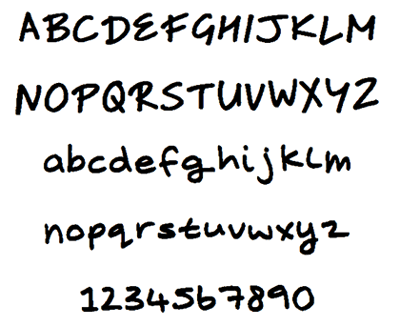
After a highly entertaining half an hour with my work colleagues and fontifier, I now have a full operational font of my handwriting. It looks a little childish and insane, like the kind of thing you’d write threatening letters with, but it looks great as the default font on OSX’s Post-It equivalents. Should you be foolish enough to want my scribblings on your computer, feel free to download it from here: Coates.ttf.

Categories
Design Personal Publishing Technology

Using Wikis for content management…

So here’s a thought partly inspired by an e-mail from a work colleague and partly by Haughey.com. Creating and editing wiki pages is extremely simple and elegant once you get past the first 30 minute learning curve. And essentially you end up with a page that’s got an incredibly simple template, pretty well marked-up code (or at least could do if you used the right Wiki system) and can be edited incredibly quickly. Now, imagine for a moment that the Wiki page itself is nothing but a content management interface and that the Wiki has a separate templating and publishing engine that grabs what you’ve written on the page, turns it into a nicely designed fully-functioning (uneditable) web-page and publishes it to the world. It could make the creation of small information rich sites enormously quick – particularly if you built in FTP stuff.

Now one of the problems with using Wikis generally is that they don’t lend themselves to the creation of clear sectionalised navigation. Nor do they do naturally find it easy to use graphic design, colour or layout differently on separate pages to communicate either your context or the your location in the site. That’s not to say that Wikis are broken, of course, just that the particularly networked rather than hierarchical model of navigation that they lend themselves towards isn’t suitable for all kinds of public-facing sites (the same could be said of the one-size-fits-all design of the pages). This would clearly be a problem. Wikis sacrifice that kind of functionality on the whole in order to gain advantages in other areas (ie. collaborative site generation and maintainance). Without those advantages, you’d simply be left with an inferior product.

So how to integrate design and architecture into the production of a wiki-CMSed website? Well, it’s not a particularly new question with regard to wikis generally – loads of suggestions about how some kinds of hierarchy could be built in have been made and some of them implemented. On the whole they’ve not been terribly successful as they present a higher level of user-level complexity, and with a lot of potential naive users, publically editable wikis can’t really afford complexity. But that’s not true if only one person or a small group were to be updating the site. The complexity level could increase a bit and the learing curve would have to be just a little steeper initially.

Here’s an example of how you could create hierarchy and utilise different templates at the level of the individual page. First, imagine a templating interface that allowed you to create an outline hierarchy of the various sections of a site (just like you’d produce in the outline view of Word or using something like OmniOutliner). Now, each section of that site-map could have a distinct template attached to it, or inherit a template from the section above. Then all you’d need on the Wiki-page (as content-management interface) would be a drop-down box on the right that allowed you to choose which section the page you’d created would sit under. Given that, you could use the mechanics behind the templating engine automatically generate a variety of different models of hierarchical navigation and breadcrumb trails which you could embed into your templates (you could use a templating mechanism very much like the one used to move content chunks around weblogs using Typepad). And the same part of the Wiki page that you use to decide which section the wiki page should be contained within could also house a .gif thumbnail of the template for that page. And the assigned section of a new page could even default to that of the page from which you created it – forward-link from a page about Troubleshooting (in the section “Help”) to create a page about Error Messages, and Error Messages is automatically created inside the “Help” section initially. And all of this could then be ‘published’, pushing everything out in a lovely stylish elegant and visually rich format to the rest of the world at the push of a button.

Wouldn’t that be cool? Blogger-style management for all kinds of other sites… The only things that don’t seem obvious to me at the moment is how you make the intra-wiki links not look like Wiki links to the general public while preserving the ease of use that they engender for the person creating the pages… Any thoughts?

Categories
Design

On The Guts of a New Machine (Part One)

I’ve been reading The Guts of a New Machine, the latest (and longest) article on the iPod perpetrated by the New York Times. It’s an interesting article that does the journalistic job of covering a variety of angles well while trying to find some unifying theme – but that makes commenting on it in general almost impossible. It itself has no thesis – no argument to make. So instead of addressing the piece as a whole I’m just going to jot down a few thoughts that occurred to me as I read specific chunks. I’m going to do this in multiple posts as it should make commenting more practical.

On rapid product development and coherent product vision

“The iPod came together in somewhere between six and nine months, from concept to market, and its coherence as a product given the time frame and the number of variables is astonishing. Jobs and company are still correct when they point to that coherence as key to the iPod’s appeal; and the reality of technical innovation today is that assembling the right specialists is critical to speed, and speed is critical to success.”

This chunk of the article (not a quote from anyone) interested me, because of the perceived dislocation between speed, the right staff and coherence. The process seems to me to have been successful in producing something coherent and clean almost because of its brevity. In my experience, three months is about as long as you can reliably expect any individual person to care about their part of the project more than they care about anything else – even if they’re given total free space not to have to think about anything else (multi-tasking is the evil enemy of creativity in my opinion). Only clear delineations between stages in a project (and strong management over those transitions) can really help maintain people’s levels of constructive engagement if you need a project to go any longer.

When I see the iPod and hear the time it took to think through it, I can almost smell the initial back-to-basics workshops, the brainstorming around what MP3 players could and should be at their core. You can feel the desire to understand something – grasp a vision – and the reason that sensation still sits at the heart of the thing is that there wasn’t enough time for that vision to erode before it got to market. The iPod’s design to me isn’t really about simplicity or coherence at all, it’s about getting to the essence of the thing and sparsely sketching it out without letting the cruft or baroque tendencies unfold. Where human beings are involved, design is a process in time, and the quality of that design can be affected directly by too-little time, too-much time, and not know what to do with the time you have.

Categories
Design

If people don't notice it, it's not architecture…

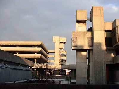
I’ve just caught up on my Dreamspaces and been confronted with a conundrum. In a piece about brutalist architecture, they featured the Tricorn centre in Portsmouth. Here’s a picture of the building in question:

Now, this building hasn’t had the most illustrious of histories. It was built in 1966, given an award in 1967 and voted Britain’s fourth ugliest building in 1968. It is generally reviled by the public and will not be protected by government by being listed. But when the architect – Rodney Gordon – is asked about the general distaste towards his building, he replies:

“Well I’m very surprised. A lot of people liked the building. One thing I do find is that any piece of architecture worth being called architecture is usually both hated and loved. If people don’t notice it, it’s not architecture.”

That last phrase seems extraordinary to me – stunning in its arrogance and audacity and completely in opposition to most of the understandings of design and architecture that I’ve accumulated over the last ten years. That kind of ostentatious statement of impact above function was given up within the first ten years of web design. What Gordon is talking about is the construction of follies – buildings with little or no function but to inspire and awe. Unworkable spaces, unusable spaces. We have them on the web too – sometimes even intentionally – either as art or design showcases or as image-based impactful press prelease or advertising spaces. But this is different. This is a site – a space – designed for shopping and socialising that wants desperately to be innovative and impressive – the architect all the while dismissing the subtle and less overt arts of flows and usability, building things that are not scaled for humans or comprehensible to them. All the things that allow a place to be understood by people are dismissed as unworthy of the name of architecture. And why – because the building must be noticed… It’s stunning. It’s terrible. And I’m fairly sure it’s wrong.

If you’re interested in the Tricorn:

Categories
Design

A brief design history of plasticbag.org

I’ve wanted to do this for ages, but I’ve never had time just to push it out into the open. So, without further introduction, here’s a brief design history of plasticbag.org neé Barbelith.

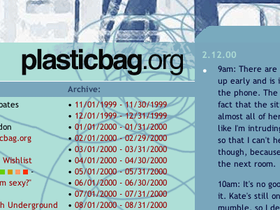
Barbelith, it has to be said, had designs that predated this one. It had a number in fact. Unfortunately none of them have survived the test of time very well – files have been lost and archive.org hasn’t recorded their passing. The first vaguely well-constructed one (click on above for full screen-shot) was built by me hacking around with tables and adding things from the top down, feature at a time. It was considered quite good at the time, and remains the only single thing that I’ve designed in my life that has garnered universal good-feeling.

Barbelith Design One

My weblog started as a piece of filler to sit on the front of my barbelith.com domain, which had within it a comic-book fan-site and what was later to become The Barbelith Underground. After a while it became clear that the people who were coming for the online community or the fan-site saw my weblog as incompatible with the rest of the community. So I decided to split my efforts over two domains – and plasticbag.org was born. I spent a considerable amount of time getting a design that I was exceptionally happy with assembled over several weeks. No one liked it. No one at all… It remains one of my favourites…

plasticbag.org Design One

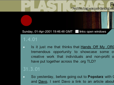
The main criticism of the pale-blue plasticbag.org design had been that it was too cold, so when I came to version two I made a conscious effort to make it more friendly. During the process I got terribly excited about ways of using black in tasteful and creative ways, the integration of random images into designs and the potential of right-aligning sites. I got particularly interested in ways of crafting a site that looked well-finished, which was why I put such a lot of effort into the bottom of the page – an area normally considered with distain or indifference by webloggers (with a few notable exceptions).Of my plasticbag.org designs, this is the one I look back on most fondly.

plasticbag.org Design Two

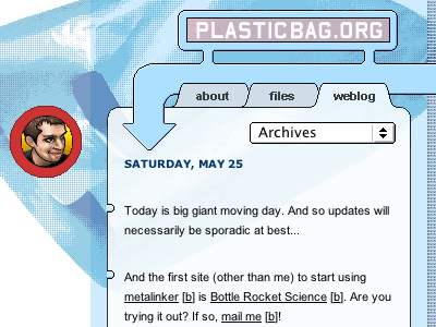
Version three of plasticbag.org came about because I was desperately pining for elements of the pale blue design which I’d always seen as representing the kind of modern disposable slightly artificial mood I’d always wanted to generate. This time, however, I was working with a classy designer of considerable repute (Denise Wilton) and she was patient enough to round robin designs with me until we came up with something I really liked and thought captured the mood of the site well enough. It had several ‘innovations’ for me – it was my first pure CSS site and the most difficult to build of anything I’ve ever made. It never worked perfectly in any browser. There was always something that made it feel wrong. It also used different style-sheets for the internal site and the front-page, so I could put content on half of the index and let it fill the page when you went into the archives. It was a nice trick, but fundamentally flawed. The text on the front-page was not a suitable width for long-reading, and I came to write smaller, more condensed pieces simply because it was all a reader could manage. Images had to be tiny to fit the width and then looked out of place internally. It was a glorious folly, but it was a folly nonetheless…

plasticbag.org design three

The design that replaced it is the one you’re looking at today – which brings us to the end of our little tour. I have nick-named this one “kottkesque”, it has some fairly obvious influences (kottke.org) and its creation came as a bit of a shock even to me. I spent an idle couple of hours thinking about what it meant to design a site for the weblog format – which was concentrated around putting long tracts of readable content on a page with almost no navigation at all, but instead quite a lot of ambient persistently useful peripheral information. And the more I thought about it, the more Jason’s work just seemed so practical – as if he’d uncovered a kind of ideal format that we should all now be looking at and working around. His was tables-based (and still is), so I pulled it over, rebuilt it in (slightly flawed) CSS and then started to try and push it in extreme directions – looking for ways to improve it in terms of branding, navigational areas and contextual information.

I’m not sure I succeeded in making that much of a contribution to what-comes-after his design scheme, except maybe in terms of abstracting navigational items in that top space. Quite possibly Jason’s design remains the clearest and most admirably platonic form of webloggery yet devised. However, I have my suspicions that his linklog/remaindered links format is pushing his format in directions it wasn’t really built to withstand, and that its showing the strain. This might be an indicator for where new investigations into weblog design should be concentrating their efforts. Perhaps erikbenson.com might have alternative lessons for us in this regard…

Categories
Design

On Jenny Everywhere…

My wonderful cult are getting a bit of exposure at the moment and it’s all because of Jenny Everywhere. My involvement in the whole enterprise was fairly negligible – I started a thread to try and get people thinking about the possibility of Open Source Comic Book Characters. I didn’t notice that a quite a substantial group of rather more engaged and creative people – particularly Steven Wintle – were (unlike me) actually getting off their arses and doing something with it. The result is not only a completely Open Source Comic Book Character that anyone can use in any book owned by any company (or indeed by anyone who wants to self-publish a book with a soon-to-be recognisable character without worrying about rights) but also a series of highly entertaining completed stories:

In the meantime, Jenny has appeared in Exclaim, “Canada’s Music Authority” as well as on Boing Boing yesterday. It’s all looking very positive. My next hope? That she’ll start turning up in cameos in DC and Marvel books – although presumably their legal departments might take a while to get around the concept…

Categories
Design Navigation Personal Publishing Social Software

On the 'one big site'-ness of weblogs…

Here’s a weird quote about weblogging: “I believe in my heart that people should come up with their own publishing methods. Frankly, it’s boring to surf the blogosphere and see so many sites using the same, tired weblogging tools. The same basic templates, the same ‘post a comment’ form, the same URL schemes! It’s almost as if they’re all small parts of one huge site.” (Adrian Holovaty).

So my immediate reaction is that the fact that there are a limited set of really popular weblogging systems has probably been a good thing, because it means there’s an active and widespread community large enough to be able to self-support, fully explore the boundaries of the software available and push for new functionality. But more importantly, there’s an element in which all weblogs are part of one huge site. And that’s only partly the sense in which all the web is basically one big hypertext entity in which all boundaries between sites are essentially arbitrarily – or culturally – enforced.

More specifically I mean that at that point where a weblog is pretty much balanced between personal publishing (micro-broadcasting or ‘one-to-some’ communication) and social software (something like a distributed discussion board) there are aspects of ‘one huge siteness’ in play – and that that’s precisely why they’re mostly working. We have a roughly common vocabulary about what an entry consists of, a set of structures about how a site works, and systems of trackback, permalinking and commenting that are pretty much interoperable (in one form or another).

I suppose if I wanted push an old comparison (that I never thought really worked) in a slightly different direction, then I’d say that weblogs needed to be ‘like one huge site’ to the same extent that a peer-to-peer network needs to consist of mostly coherent and standardised applications in order to do what it does. Maybe some of the newer responses to writing and interactions between people are demonstrating that ‘siteness’ (heimlich) and ‘unsiteness’ (unheimlich / other) aren’t categories with as much utility as we once thought – or at least that breaching or straddling them provides opportunities for new, powerful kinds of applications.

Categories
Design Social Software

The Ugly Wiki (Part Two)

A few months ago a conversation emerged across the net about whether or not wikis were ugly (see also Many to Many) (and moreover whether the fact that they was ugly affected how useful they were). Obviously, the whole issue was rife with debate about whether the simple design of wikis was simply nasty or whether it was actually just more useful and appropriate to have something stripped down to the bone.

Anyway, over the last few weeks the team that Matt and I work with has been trying to put together a wiki for our intranet. I think they’ve demonstrated that maybe there are ways of keeping both camps content – simple, adaptable Wiki designs can be made that are also elegant and attractive. First things first – here’s a quick thumbnail of Kate Rogers’ design for the page (apologies for the blue border – it’s a standard plasticbag.org thing).

I’m not sure that having the image reduced to that size necessarily does the design justice, so here are two screen-shots of the site at different screen-widths. The whole thing’s been recoded in (mostl) compliant HTML and CSS, so it’s also quite flexible:

Matt and I haven’t had that much to do with the getting the Wiki together – it was a project that existed before we got here – but we’ve had a couple of minor opportunities to help out and the whole process has been really interesting. I think most of all we’ve learned a lot about how Wikis should be rolled out to groups of people who aren’t really familiar with them – in particular the importance of transmitting the culture and the ethos. It’s still a bit of a work in progress, but it’s looking increasingly like it’s actually going to work…

But before I say any more about rolling out Wikis, major kudos to Paul Clifford and Joss Burnett – when we arrived in the department they were experimenting with Zope as a substrate for the intranet, and had put Zwiki in place for the wiki. But when we actually came to working through Zwiki’s rules for text-formatting, we were all a bit startled – they were extraordinarily arcane and complex. So we researched the problem a bit and looked at various kinds of wiki mark-up and discovered that there was not only a massive variety of them, but also that many of them operated on completely different principles from one another.

After considerable examination, we decided that MoinMoin‘s parsing was probably the most effective and useful for our purposes, because – even though I don’t think they’re as simple as Usemod – it’s powerful and has a relatively shallow learning curve. At which point Paul and Joss spent considerable time and effort building a highly effective MoinMoin parser for Zwiki – giving us all the benefits of Zope with a Wiki that is actually simple enough for non-technical members of the department to use. General consensus here is – that if we are able – we’re going to throw all this stuff (design and code) straight back out into the public sphere for people to work with and play with… More news on that as we have it…

Coming soon… The Ugly Wiki (Part Three)

Categories
Design

On Camden's tube redevelopment…

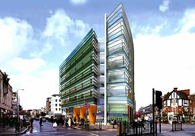
The plans for Camden Town’s proposed tube redevelopment have been around since the end of last year, and I imagine debate has raged in the area. I’ve only just stumbled upon them though. My only real issue with them is that I wish they’d found a way to incorporate some of the current facade into the new building. Parts of London already feel characterless and inhuman – I can’t help feeling that those early twentieth century tube station designs are almost iconic now, and that their loss would be a terrible shame…

camden_station.jpg

What do you guys think? Is it more important to preserve the identity of a city or to look to the future? Is Camden moving in the right direction?