This is absolutely the last post on visualisations of plasticbag.org data unless someone sends in something else really cool – and this one is more of a clarification than anything else. Daniel Boyd created this really cool model of post time that had accurately predicted both the times I woke up and went to bed, but it had seemed to go a little pear-shaped as a visualisation at the time I switched to using MT. I’ll post the original graph below for those of you too lazy to look at it in its original context (slackers):

Anyway, the confusion emerged at the beginning of January 2003 when suddenly it looks like I was staying up all night and posting at completely random times of the day. I instinctively felt like this could not be right – and by instinctively I mean that I knew it wasn’t right because I’ve become mostly old and predictable in my early thirties. Enter Tom Carden again, who writes:
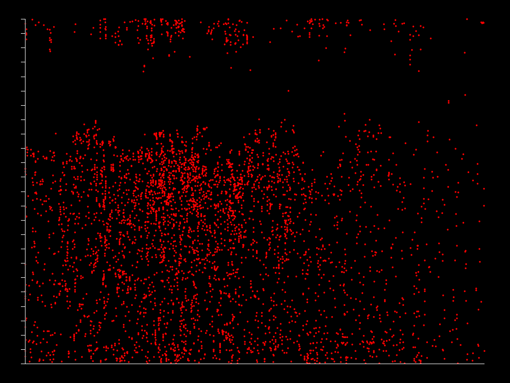
“The time of day chart is great, but I suspect that more careful analysis is needed here. For instance, I believe that the move to MT coincided with the enabling of comments. I suspect that’s why the time chart suddenly goes strange. Here’s one without the comments. It’s as you might expect – pretty much the same times, but less frequent.”

He’s also generated a visualisation that shows comments as green dots and trackbacks as blue. It’s harder to interpret these on images reduced so much, so if you’re gripped by this whole subject area you might want to check out his two larger-scaled graphs: Without Trackbacks and Comments and With Trackbacks and Comments. The smaller version looks like this:

By way of intepretation then, I think it’s clear that since moving to MT my posting has dropped enormously (there are other reasons for this of course – including my rather hardcore nine months working on Radio 3. Perhaps more interesting is that the same posting patterns during the day appear to have continued (first posts between eight and ten in the morning – last ones between 12 and 2am) but there is more deviation from this practice. Whether this just represents being at conferences in other time zones or something isn’t clear to me.
Looking at the comments and trackbacks, it seems clear that they’re much more consistent during the day and night – which probably reflects a fairly international audience (or a lot of insomniacs and filthy drunks). There does appear to be a bit of a concentration of comments at least between midday and six UK time – although that may just be a result of comments lagging after specific posts. That would also account for the fairly heavy striping in comments up and down the page – on occasion I seem to write something that a lot of people want to comment upon. The rest of the time – not so much… There are also some fairly clear stripes of total inactivity emerging – February/March-ish of this year seems a complete dead zone as does a good period around two-three months ago.
I think generally what this little project has taught me is that statistics and visualisations are are both really good fun and that they can expose to you patterns and behaviours and causalities that you may have suspected were there all along, but couldn’t be certain about. Along with projects like Audioscrobbler, I feel like I’m starting to get a strange and exotic new statistical understanding of my life. I can look at these diagrams and see myself in them. It makes me want graphs of the fibrous content of my excrement automatically generated by my loo – and a complete break down of the percentage of my floor which is covered with rubbish and books at any given moment in time. Somewhere in this stuff is self-knowledge!
2 replies on “Visualisations lead to self-knowledge…”
Warning: Windy road ahead
Everything is so overwhelming these days — having moved from one continent to another, from one lifestyle to another, from…
Cut-ups of my Top 10 posts of 2004
I thought it would be interesting to take my 10 most-visited posts of 2004 (as
listed in my previous
entry) and produce some random cut-ups of the text. In a way I’m applying