Categories
Gaming Net Culture Social Software

On things that aren't fun, and fun that is bad…

Last Friday – around ten in the evening – Pentheus, my main character in World of Warcraft, hit level sixty. Thinking back, I’m now not entirely sure where he was when this happened, although I believe it was in the wastes of Silithus. I waited until I’d got to the Altar of Storms to start my quests for my Dreadsteed before I took the above picture.

I honestly don’t know how I feel about the whole thing. It was – frankly – sort of an anti-climax. Nothing happened, I just remained being level sixty. There was no sense of a threshold being reached. My character – the same character I’ve been playing on and off since November – was just slightly more powerful than he was before. And a whole range of long extended new quests wandered off before him. There would be no new spells, no new pets, no real development – except in sets of armour and property. Each quest, each raid will now be longer and more involved than they were before – a dungeon taking two or three evenings to explore properly and requiring a group of people to play with that I’ve struggled to collect along the way. The whole game now feels very laborious and slow – the simple pleasures of earlier in the game, where you were picking up new abilities and developing quickly have just disappeared, to be replaced with something more drudgelike, robotic and … as the people in game describe it … grinding.

Now the interesting thing about this is you’d think that was a very good reason to stop playing the game immediately – but somehow no. My relationship with World of Warcraft is a lot more complicated than that – so complicated that it’s forced me to reconsider a lot of my assumptions about gaming. These assumptions have been further challenged by reading Raph Koster’s book and weblog, A Theory of Fun for Game Design. The two experiences – reading and playing – have not pushed in the same direction however – they’ve not led me to the same conclusions – and this has resulted in me spending a lot of time wondering about the relationship between entertainment and productivity, fun and work, drudgery and compulsion. I’ve started wondering whether a game could still be considered good if you want to play it a lot but at the same time resent the time that it takes from you. What if you find it boring but still somehow can’t put it down. Can you love and hate a game at the same time and still call it ‘fun’? Can a game be a narcotic, or a guilty secret or an addiction? Can it be a fruitless activity without value that still feels good

Raph’s book includes a really interesting analysis on what games are, and what fun is and is not which is far too long to quote in full here, but which includes this summary:

Games aren’t stories. Games aren’t about beauty or delight. Games aren’t about jockeying for social status. They stand, in their own right, as something incredibly valuable. Fun is about learning in a context where there is no pressure, and that is why games matter.

This sort of fascinates me because it contains a weird twist of logic – that fun is learning without pressure, and that therefore games matter – presumably because learning is de facto a good thing. But what if you’re learning a system or a landscape with no transferable value – what if a specific game presents you with a structure designed to purely generate the sensation of perpetual fun by short-circuiting the learning impulse and misdirecting it into valueless territories? There would be a memetic advantage in being a game that could be intoxicating in that way without requiring that people learn skills that were transferable elsewhere. For a start, real-world skills are harder to develop and perhaps less short-term satisfying. Secondly, a process that teaches you real-world skills would result in you evolving and changing. A game that could short-circuit your learning instinct wouldn’t have to do that. There would be no reason for you to leave.

There’s another quote in Raph’s book which is about what happens when you get older and why people stop playing games. He says, “We don’t actually put away the notion of ‘having fun’ as far as I can tell. We migrate it into other contexts. Many claim that work is fun, for example (me included). Just getting together with friends can be enough to give us the little burst of endophins we crave.”

I think this is really interesting, because it hits on a few more weird contradictions – working can be a learning exercise, it’s true, but there’s normally some risk involved. if you do bad things in a job, you can be fired. There are consequences. So that seems rather at odds with his earlier sense of fun. And a work environment has no formal ruleset, has no structure that you’d recognise as game-like. And of course it can have real-world rewards. If work can be fun, then I’d argue that’s not because it’s like games – an environment in which you can learnwithout risk, but precisely because it’s not like games, the productive element generates a satisfaction that is totally missing in World of Warcraft. The creative and generative element is also absent. Perhaps the reason we think of games as a childish activity is because play in our youth is supposed to inform work in our adulthood. Perhaps then, a game that feeds on our desire to learn and our childlike instincts but cannot give us the satisfactions of creation or real dangers, is a con, a short-cut, a parasite. Perhaps adult gaming is nothing more than an opiate, designed to provide satisfactions and a sense of development or progress that the real world is unable to provide for most people, or that people are too nervous to fight for.

Apparently you can get a character on World of Warcraft to level sixty in about three months of consistent after-work play. Personally, my experience has taken me three times that length of time, and has been squeezed around long hours on work projects and more travelling than I’ve ever done before. Given that it hasn’t massively compromised these parts of my life, I’m guessing that the level of compulsion I’ve felt to play has not been massively excessive – but it’s still felt like a time sink that somehow claims me for my out of work creative time. That really worries me.

Let me put it this way – while I feel no massive compromise to my life is occurring now, while my relationship with the game is merely grudging at the moment, I can imagine coming to hate the game and yet still wanting to play it. Is that an extraordinary statement? Is that a piece of self-insight there, or is it something about the game? I can’t tell where the fault lies if there is a fault? Can you build something that is too addictive simply in the way it presents challenges and rewards, to the extent that it becomes psychologically addictive. Can something with no pharmaceutical components be a drug? Or is this simply a matter of self-discipline and self-control? How tempting does an alternative world filled with mechanisms for alleviating status anxiety have to be before the space between fun and craving gets crossed? Is television any different? Am I just coming to some weird form of Protestant neurosis in my mid-thirties?

One of my older posts is currently full of people talking about their problems with World of Warcraft in particular – wives saying that her husband ignores his children to play, men who say they would rather play WOW than have sex with their wives, teenagers who say that they’re failing school so they can play, and it’s led me to this weird point. Are they all making excuses? Is the game a scapegoat? Are they weak-willed and to be pitied? Or are we as a culture starting to construct toys that are too effective and end up hurting people? I know it sounds alarmist, but I really want people’s opinions. What do you think?

Categories
Links

Links for 2006-08-09

Categories
Politics Social Software

On Massively Multiplayer Propaganda…

Simon drew my attention to a site called GIYUS.org the other day and it’s been in my thoughts ever since, and I’ve come to think of it as a really troubling kind of troll-supporting political malware, representing a technologically-empowered massively-distributed form of propoganda that I’ve never seen before. The site’s full name is Give Israel Your United Support and it works like this – individuals download a tool (the Megaphone Desktop Tool) which then alerts people to new articles and polls around the web that question Israel’s policies in the Middle East or ask for public opinion about them. The people concerned are then supposed to visit the site directly and respond to the poll or story or write an e-mail or whatever. They present an example on the page of one of the things that you could be alerted to:

The reason for this activity? Stated at the top of the page, “Today’s conflicts are won by public opinion. Now is the time to be active and voice Israel’s side to the world.” The software is designed to do two things – firstly to make it clear that there’s a large active pro-Israel population in the world, but also it’s there to make sure that the pro-Israel point of view is over-represented in the popular media. These are – let me repeat – the project’s stated goals.

Now I want to make it very clear here very early on that I’m not going to be making an anti-Israeli tract. It’s pretty much irrelevant to me who is using this particular tool – just that the tool exists. Or more specifically – since there’s no way to put the genie back in the bottle – that tools like this exist and will continue to exist from now on as ways to attempt to deform the social discourse – whether that be for Democrats, Republicans, Israelis, Iraqis, Americans, Conservatives. This should be troubling to all of us, although I’m not sure that there’s very much we can do about it.

The short term consequence will be that all large scale public discussions and polls on the internet will become highly suspect – none of these groups are set up to deal with this kind of political spam yet. And that has to heavily affect the ability of organisations that deal with feedback from their audiences to do so fairly or to respond to a real constituency rather than just innumerable interest groups. This is, in effect, a way of harnessing hundreds of thousands of people to massage the public debate – the massively distributed conversation of the internet now has a form of PR – a form of propoganda – to match.

In substance, of course, there is little that has changed here – politicians and religious groups have always wanted to get out their vocal supporters, they’ve always wanted to move public opinion and help people spread the word. And they’ve used all kinds of techniques to do it – right back to the simple letter-writing campaign. And it’s far from the first time that new communicative, democratising technologies have been co-opted or bought ought by organisations who believe that they have to – or simply wish to – take every advantage they possibly can to win, even if it devalues the environment for all in the process. But it’s still something to be pointed towards with anxiety, to be acknowledged as it is recognised – if only so we can mourn the passing of a particular open spirit as the gamers and the trolls colonise the public spaces and set-up shop. We can expect to see this kind of campaigning tool being used in the next US elections I should think, and who knows – perhaps people I know, people like me, will feel they need to use them to see the change they want in the world, or to fight fire with fire.

Of course there is another way this could end. Because a tool that alerts people to points of debate around Israel isn’t only useful to Israelis, any more than a tool that alerts the Green lobby to big issues is of use only to environmental activists. I wouldn’t be surprised at all to see the same tools exposing the same data being co-opted by the direct opponents of the various groups that set them up. Each poll or news article may become nothing more than flashpoint fights between radicals of every persuasion in which the quieter, more average voices get completely drowned out. So there you have it – flashpoints of argument, massively multiplayer campaigning and propoganda techniques, the loss of the common voice and a scouring of the commons. So much for a democratising medium…

Categories
Links Random

Links for 2006-08-08

Categories
Design Net Culture Personal Publishing

On Carbonmade…

There’s a site that I keep coming back to because it’s so simple and well-constructed, and yet also represents so many of the visual and interface design principles of the current zeitgeist. It’s a site that has design smarts massively in excess of what would normally be necessary for a utility of its size and scope and needs of its users singularly well. It’s a site that I find myself returning to again and again for inspiration when I’m thinking about other projects. The site is carbonmade.com.

Carbonmade Homepage

The service is simple – this is not a complex web app. It’s a place where designers and artists can come to quickly set up a really simple, clean and elegant online portfolio. It’s got a few problems around the place which I’ll come to later, but right now I want to concentrate on the great things about it and how generally well it’s been assembled.

It is, as must be clear from first impressions, drenched in the current design tropes of Web 2.0 – the fonts are large and there are gradient fills all over the place, but it’s all done with rather more character and personality than many other sites and introduces a few innovations along the way. This is a truly elegant riff on the current thinking, rather than a slavish copy.

Let’s start at the beginning – the character of the designer is the heart of the enterprise, and how to represent them and their work in the best possible way. Hence the cute, but not overly cartoonish character of the designer presented in front of an expressive green spray of look-at-me-ness. The whole site is already really there in that image – along with the six words that dominate the front page, “Sign up for your free portfolio”. Add the tagline, “Show off your work,” and you’ve just communicated the whole purpose of the enterprise in about three seconds of visual parsing time. If you’re a designer or an artist, you now know what the site is for:

The first thing you’re pushed towards doing on the homepage is to either play with the demo portfolio or start your own. The demo is a really solid idea – there’s no risk in misrepresenting someone else, no half-botched effort that other people can look at and mock you for. So if you’re a little unsure about this interweb thing, then you can play quickly and try it out with no risks. And I don’t doubt that – for the most part – sticking the demo up there has really paid off for them in the past, because the interface is incredibly simple – you basically create a project and then add things to it – using large, clear and open interface elements on large blank spaces. There’s no visual complexity. No confusion. No swathes of threatening buttons or navigational options. It’s all relatively simple. There are a couple of minor things I’d resist in that interface, I think. But they’re few and easy to fix and will probably condense themselves a little bit in some time.

Once you’ve got your pictures onto the page you can specify some very basic design attributes to help you define what your portfolio will look like. You can choose whether there will be text displayed on top of the thumbnails; whether you’ll get one, two or three thumbnails in a row on your front page; whether the background should be white or black; and whether it should use serif or san serif fonts. All through the process, mostly successfully, they’ve looked to see which of the Ajaxy or DHTMLish design elements would give you the feedback to know that something’s happening behind the scenes. They’ve also made elements of the UI discoverable, like the ability to reorder photos. You don’t need to use it, but eventually you’ll twig and it’ll be there wait for you. There is no rotate feature. There is no group functionality. There is little or no metadata. This is an experiment in creating super-elegant UI for a niche audience with a simple function to perform and when it works it works beautifully.

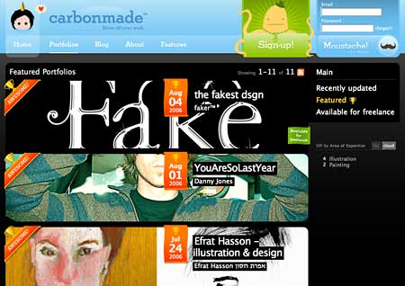
I think my favourite part of the site is the portfolio-browsing section. The porfolios themselves are pretty self-contained entities. There would be little reason for a client to want to know how you were presenting your work, so carbonmade restrict themselves to a small link at the bottom of each portfolio page directing you back to their core site. But that doesn’t mean you can’t explore the portfolios in the other direction – they maintain an index of all of the collections people have made, along with interesting ways of exploring them. There’s enough design inspiration in there already to last a couple of months. And they’ve done a really beautiful job in making all the work within the site look exciting and interesting. Have a look at their featured portfolio index page:

The whole thing feels tremendously immersive and exploratory and interesting – but more specifically, while the pages aren’t necessarily particularly light, the HTML is mostly solid and decent and degradable. As I said earlier, it’s not perfect, but it’s bloody good. And fun. And cool. And engaging.

The porfolios themselves are slight and elegant things which really let the artworks of the people concerned shine through. They constitute nothing more than an index page which lists the projects with a thumbnail, a page for each project with a Flash gallery upon it that you can use to scroll backwards and forwards through the pictures in that section and a page where you can talk a little about yourself as the creator of the galleries. This is no Flickr – it has no need to be. Here’s an example porfolio:

It’s literally an online portfolio in the sense that the background is as generic a property as the large leather presentation cases that graphic designers take with them when they’re trying to get work.

Anyway, I said there were problems with the site, and there are. Not all the interface elements are quite as self-explanatory as perhaps they might be, some of the exploratory sections feel a bit hidden as you’re encouraged quite forcibly to sign up and start using the, the portfolios have some odd navigation options that hide how you get back to the homepage and – my main issue – the individual images within each gallery tend not to be linkable. Because of the Flash elements you have to link to a project rather than an individual picture. But these are all fixable.

And in the meantime, I’m really getting something off the aesthetic and the scale of the thing – the expressiveness of the interface and the way in which it has made itself into a place that both has a personality but also has the class to get out of the way when it’s showing other people’s work. I think it will define as many of the next stage design tropes as it has stolen from the current ones and is well worth keeping an eye on…

Categories
Links Random

Links for 2006-08-07

Categories
Advertising

On super-bizarre BBC Adword placements…

It’s probably the context that weirds me out, but still. I was watching this completely freaky acid-trip of a Simpsons parody (imagine David Lynch directing and you wouldn’t be far off) made by the Something Awful crew and being slightly creeped out by the whole thing when I notice something even more puzzling:

Click on the ad and it does, in fact, take me to the BBC, specifically to the Hereford and Worcester page of their local TV console thing. The page doesn’t really work on my Mac, but it does resize the window which is nice. Anyway, that wasn’t the point. The point was… wtf?! Probably more weirded out by the connection of BBC Kidderminster with dirty parodies of The Simpsons than anything else, but still. I didn’t even know the BBC did Google Adwords. I suppose someone else could have done it. Not that it’s necessarily bad or anything. Just freaky weird.

Categories
Design History

On the design of American State flags…

A few weeks ago I found a weird little sideline in the project I was working on that I decided to explore for a while and it drew me inexorably towards a subject that I’d never even thought about before – American State Flags. It’s quite difficult to trace the path that brought me to these symbols – I was exploring some ideas around editorialising flat-termed folksonomies, trying to gett a generic word and giving it some kind of personality. Many words with competing meanings don’t really fit this kind of activity very well, but US States seem to handle this kind of stuff relatively easily (or at least, there’s pretty clearly a dominant meaning for most of them, even if there are multiple meanings). I imagine I’m losing most of you. As I said, it’s hard to explain.

Anyway, I’d decided that I wanted to explore ways of representing US States visually, and the most obvious way to do that is to use the map of the state or an outline of it’s shape. But finding a coherent way of representing states as outlines within a fixed width space without them all being massively different heights or radically different scales (or just looking dull) seemed impossible. So I found myself looking at State flags as a way of representing some of the colour and personality of the places – and they are extraordinary. There’s enormous variety – a complete range of styles from the classically-influenced through to the almost corporate. Some are high quality bits of design work, some are very much not. Some seem bounded by traditions of Heraldry, while others appear to have been knocked up drunkenly in a backshed a hundred years ago. I imagine outside America most of these flags are completely unknown. So I thought I’d go through a few of my favourites in alphabetical order and do a bit of a clumsy design critique upon them. The pictures that follow are all from Wikipedia and I should probably say before I start that my comments are not designed to be about the states themselves, just their flags, so please don’t lynch me, people of Nevada…

This is the State Flag of Arizona, the stripes apparently representing the original thirteen colonies of the US in conquistador colours with the copper star representing the state’s copper mines. I’m sort of puzzled by it – it’s kind of weirdly evocative, but there’s something very wrong about that star in the middle. It looks muddy and confusing to me. Perhaps it’s a bad reproduction. Find out more about the flag of Arizona.

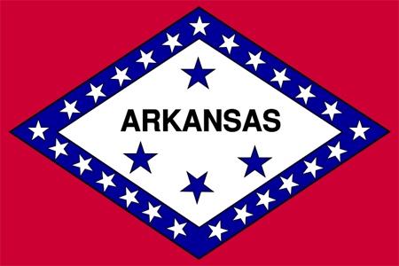
I hope I’m not about to offend anyone by saying that the flag for Arkansas (the winner of a 1911 design competition, subsequently revised over the next fifteen years) reminds me of the label of a sardine can. It’s a resolutely puzzling piece of design work – laden with stars distributed semi-assymetrically and apparently at random (there is meaning to them, but it’s a fairly forced meaning). I would say this was not an enormous design triumph for the state, and – given how new the flag is – quite possibly up for a redesign. Find out more about the flag of Arkansas

Now I have to say I pretty much love the California State Flag, even though it doesn’t really seem to me to particularly capture the spirit of the state that I know. It’s clearly reasonable solid on design grounds, but I think it’s history gives it a character that some other state flags don’t have. A much much simpler version of the flag was first flown during the Bear Flag Revolt in Sonoma (a beautiful town I’ve visited a few times on online community business). The revolt came about when U.S. Army Captain John C. Fr√©mont persuaded the locals that the current Mexican government of California was about to attack them. Years later a revised version of the flag was adopted by the State. The original flag was in fact only flown for a couple of weeks before being replaced by the flag of the United States by officials of that power. However, the flag survived up until the great San Francisco earthquake of 1906 and in pictures appears to be a hand-crafted, rather clumsy but quite beautiful piece of cloth. The current design is a quite substantial reworking of that flag. Both versions feature the bear, which apparently was nicknamed Cuffy by Midshipman John E. Montgomery.

As a composition it seems to me to be pretty solid – the red stripe at the bottom gives a flag-like feel and a grounding to the work – with the star at top left balancing it all pretty successfully. The bear has been pretty well stylized and the grass doesn’t seem too forced. It’s all pretty solid. Even the font on the flag seems to fit quite well. American state flags seem to have an unusual amount of writing on them. Normally it’s a disaster – but not here. In fact the only thing I’d say about the flag that troubles me a bit is that its revisions from the original have maybe left it a little too airbrushed and carefully branded. Find out more about the Flag of California

I’m going to stick my neck out now and say that I think Colorado’s state flag is the worst flag of all the US States, and I’m going to put this down squarely at the doors of design amateurism. Apparently none of the colours or the shape of the ‘C’ were fixed by the legislature for decades after its original creation. Bad branding! I’d fire that particular agency in a moment. There’s also an alarming lack of meaning to the thing. The blue apparently represents ‘sky’; the white, ‘snowcapped mountains’; the red, ‘earth’ and the yellow represents the sun. If it wasn’t for the ‘C’, therefore, this flag could cheerfully be used to represent pretty much any country in the entire world. In fact, to me it looks more like a bad corporate logo – perhaps for Carolco or something – than a State flag. Bad form, Colorado. Very disappointing. Find out more about the Flag of Colorado

In terms of bizarre flags, Hawaii takes the biscuit. The flag officially predates most of the states in America itself and in its semantic cross-breeding gestures towards some of weird compromises in the state’s history – apparently representing an attempt to hybridise the flags of the UK with the US. That Hawaii still flies a flag with the Union Flag of Britain in the top left corner is – frankly – a bit weird. And given that the Union Flag is already rather overloaded with design elements and meaning (being itself a hybridisation of the flags of England, Scotland and Ireland), Hawaii never really had a chance… Find out more about the flag of Hawaii

Among the people I’ve shown it to, the flag of Maryland triggers really dramatically different responses. Some find it headache-inducing, but I absolutely love it. In design terms at least it’s totally distinctive and stark and sort of beautiful. Historically, it’s a bit more troubling – apparently being based upon the heraldic banners of George Calvert, 1st Lord Baltimore. There’s a twist though – originally only the gold and black elements were used for the flag until the Civil War, when secessionists chose to represent themselves under the red and white colours. After the Civil War, the flag was changed to represent both halves of the struggle. Find out more about the flag of Maryland

This is the flag of Mississippi. It is, I think, rather a clumsy design effort centred around the ‘stars and bars’ of the Confederate flag. The square in the corner is clearly a different aspect to the flag itself which makes the thing look inbalanced – particularly with the diagonal lines in it. The white surround to the square confederate design is also a design compromise to allow it to sit next to the red bar without a weird bleed. It’s just clumsy clumsy clumsy. In 2001 a replacement was proposed which replaced the Confederate cross with a series of circles of stars. The replacement was – I think – a significant improvement – disposing of the diagonals for one – and looked more balanced and mature. It’s still far form a beautiful bit of work, but that’s sort of irrelevant since the replacement flag was firmly rejected by politicians of the time. Find out more about the flag of Mississippi

The flag of Nevada troubles me a bit, mainly because of the large slogan, “Battle Born” stuffed unceremoniously in the top-left hand corner. This is supposed to reflect that the state was created during the Civil War, but seems to me to be the kind of thing that could encourage your citizenry to confuse aspirations of solidarity with violence towards outsiders. Seems to me that flags should help you aspire to something rather better than fighting. Design-wise it struggles with fonts and writing like so many of the US State Flags, but at least it does so more discreetly than some of the others. Find out more about the Nevada State Flag.

Now this is a classy flag – simple, elegant, modern and reflecting the history and people of New Mexico. Or at least so it would appear at first glance. The symbol in the middle is a sacred symbol of the people of the Zia pueblo and represents the Sun. That would probably make you think that the flag was a sensitive representation of the indigenous peoples of New Mexico. Unfortunately, given that the indigenous peoples of New Mexico are desperately trying to get their symbol off the flag, that’s probably not the case. Still in design terms, I think it’s a triumph – simple, elegant, stark clean colours suggesting the atmosphere of the place. All very interesting and well put-together. Find out more about the Flag of New Mexico

Now this is a strange one – the flag of South Carolina – that I’ve put up mainly because of the weird associations that it triggers in my mind. At first glance it seems like a picture of a palm tree and a crescent moon, and I’m afraid that immediately triggers thoughts of Middle Eastern flags to me. I’m not the only one, it seems. In terms of symbolism there are a whole bunch of articles online about how the crescent moon came to be associated with Islam. I can’t quite imagine South Carolina as an Islamic state though. A little more digging reveals that it’s supposed to represent not the moon, but some form of neck armour. Problem solved, albeit in an odd way. Find out more about the Flag of South Carolina

And my final selection is the flag of Texas. It’s difficult to know what to say about this flag, except that it’s solid, representative, strong and pretty much perfect for the state it represents. It’s not flowery or over-designed, it has blunt and solid symbolism (blue reflects loyalty, white reflects strength and red, bravery). As such, despite the other more florid, elegant or stylish flags from around the country, I have to say that I think this is the most successful. Find out more about the flag of Texas

If you’ve enjoyed this tour around some of the strangest and best of American State Flags, you should really explore them all on Wikipedia’s Flags of the US states page. You’ll notice that there’s a wide tradition of flags with scenes in their centre and latin proverbs. Unsurprisingly these represent most of the older and eastern states of the US. Of the flags I’ve not talked about, I think perhaps Alaska is my favourite.

Categories
Links Random

Links for 2006-08-06

Categories
Links Random

Links for 2006-08-05