Categories
Conference Notes Design Technology

Maps, Invaders, Robots & Throwies… (FOO 06)

So I thought I’d end my series of posts on FOO (which some of you may have determined was originally one grotesquely long post of approaching 5,000 words, roughly chunked to last as long as possible sometime last weekend) by talking about some of the more frivolous things that happened. You need an example? The football-playing robots were pretty extraordinary:

You can see the original by dewitt over on Flickr or – if you’re feeling particularly cheerful and playful, you can watch a tiny bit of crappy phonecam footage of Stewart Butterfield having a play with one of them. There was apparently a large football game between two teams of these monsters. I missed that, but got have a private fiddle which in the end is all that matters.

What else was awesome? There was a great set of films displayed by the Graffiti Research Lab displaying some of their work on Throwies and magnetic / projected graffiti. You can see a whole bunch of videos of their projects on their site – but can I recommend Jesus 2.0, Night Writer and LED Throwies 2.0 if you haven’t seen them already. I think my favourite bit of that particular part of the evening was when Simon started muttering to himself that they were all a bunch of noisy vandals. That particular film also introduced me to new favourite track Bustin’ Loose by Chuck Brown and the Soul Searchers. Which rocks.

Oh and then there was the Applied Mindsish rotating map table of wonder and the laser-etching machine which made a lot of people very happy / nerdy. I only wish that I’d figured out that this was going on earlier in the day when I still had time to get something personal carefully-etched with a space invader.

Speaking of space invaders, the most fun out-of-camp project was organised by Chris DiBona and heavily featured space invaders of various kinds. He’d managed to get a plane from Google to fly overhead to take photos to put onto Google Maps and Google Earth. Chris and the lovely Jane McGonigal organised one particular pretty substantial project to take advantage of this opportunity – to build a representation of a crashed Cylon Raider out of bin-liners in the grounds of the O’Reilly offices.

There’s was clearly the most technically proficient of the projects, but I think ours has a chance of being as entertaining. Cal, Simon, Paul, Heathcote, Suw Charman, Biddulph and I – with help from variously lovely people including (again) Jane, decided to assemble two massive space invaders out of large sheets of white cardboard that I’d bought on the way to FOO in the morning for the princely sum of $100. Everything was going really well until about fifteen minutes before the plane flew over when the wind blew everything away (we’d not thought about how to moor the paper down), but we ran around frantically and piled them up with apples and with any luck you’ll be able to see our stunning works of pixel art on your second-favourite maps site sometime in the next month or so. Here are some pictures to whet your appetite:

All photos from Julian Bleecker’s FOO Camp set.

Anyway, that’s my FOO experience all done and dusted. Thanks for being so patient. I hope you’ve enjoyed it as much as I have. As of Monday afternoon I’ll be in San Francisco, more than likely crapping myself with fear about the prospect of speaking in front of a thousand people. I’m around for about a week after the conference as well if you’d like to meet up. Otherwise, speak soon – after all, I haven’t said the slightest thing about Dirty Semantics yet – the talk that I gave at FOO and which I think will be occupying the dark moist spaces in the back of my brain for the next six months or so.

Categories
Design Net Culture Personal Publishing

On Carbonmade…

There’s a site that I keep coming back to because it’s so simple and well-constructed, and yet also represents so many of the visual and interface design principles of the current zeitgeist. It’s a site that has design smarts massively in excess of what would normally be necessary for a utility of its size and scope and needs of its users singularly well. It’s a site that I find myself returning to again and again for inspiration when I’m thinking about other projects. The site is carbonmade.com.

Carbonmade Homepage

The service is simple – this is not a complex web app. It’s a place where designers and artists can come to quickly set up a really simple, clean and elegant online portfolio. It’s got a few problems around the place which I’ll come to later, but right now I want to concentrate on the great things about it and how generally well it’s been assembled.

It is, as must be clear from first impressions, drenched in the current design tropes of Web 2.0 – the fonts are large and there are gradient fills all over the place, but it’s all done with rather more character and personality than many other sites and introduces a few innovations along the way. This is a truly elegant riff on the current thinking, rather than a slavish copy.

Let’s start at the beginning – the character of the designer is the heart of the enterprise, and how to represent them and their work in the best possible way. Hence the cute, but not overly cartoonish character of the designer presented in front of an expressive green spray of look-at-me-ness. The whole site is already really there in that image – along with the six words that dominate the front page, “Sign up for your free portfolio”. Add the tagline, “Show off your work,” and you’ve just communicated the whole purpose of the enterprise in about three seconds of visual parsing time. If you’re a designer or an artist, you now know what the site is for:

The first thing you’re pushed towards doing on the homepage is to either play with the demo portfolio or start your own. The demo is a really solid idea – there’s no risk in misrepresenting someone else, no half-botched effort that other people can look at and mock you for. So if you’re a little unsure about this interweb thing, then you can play quickly and try it out with no risks. And I don’t doubt that – for the most part – sticking the demo up there has really paid off for them in the past, because the interface is incredibly simple – you basically create a project and then add things to it – using large, clear and open interface elements on large blank spaces. There’s no visual complexity. No confusion. No swathes of threatening buttons or navigational options. It’s all relatively simple. There are a couple of minor things I’d resist in that interface, I think. But they’re few and easy to fix and will probably condense themselves a little bit in some time.

Once you’ve got your pictures onto the page you can specify some very basic design attributes to help you define what your portfolio will look like. You can choose whether there will be text displayed on top of the thumbnails; whether you’ll get one, two or three thumbnails in a row on your front page; whether the background should be white or black; and whether it should use serif or san serif fonts. All through the process, mostly successfully, they’ve looked to see which of the Ajaxy or DHTMLish design elements would give you the feedback to know that something’s happening behind the scenes. They’ve also made elements of the UI discoverable, like the ability to reorder photos. You don’t need to use it, but eventually you’ll twig and it’ll be there wait for you. There is no rotate feature. There is no group functionality. There is little or no metadata. This is an experiment in creating super-elegant UI for a niche audience with a simple function to perform and when it works it works beautifully.

I think my favourite part of the site is the portfolio-browsing section. The porfolios themselves are pretty self-contained entities. There would be little reason for a client to want to know how you were presenting your work, so carbonmade restrict themselves to a small link at the bottom of each portfolio page directing you back to their core site. But that doesn’t mean you can’t explore the portfolios in the other direction – they maintain an index of all of the collections people have made, along with interesting ways of exploring them. There’s enough design inspiration in there already to last a couple of months. And they’ve done a really beautiful job in making all the work within the site look exciting and interesting. Have a look at their featured portfolio index page:

The whole thing feels tremendously immersive and exploratory and interesting – but more specifically, while the pages aren’t necessarily particularly light, the HTML is mostly solid and decent and degradable. As I said earlier, it’s not perfect, but it’s bloody good. And fun. And cool. And engaging.

The porfolios themselves are slight and elegant things which really let the artworks of the people concerned shine through. They constitute nothing more than an index page which lists the projects with a thumbnail, a page for each project with a Flash gallery upon it that you can use to scroll backwards and forwards through the pictures in that section and a page where you can talk a little about yourself as the creator of the galleries. This is no Flickr – it has no need to be. Here’s an example porfolio:

It’s literally an online portfolio in the sense that the background is as generic a property as the large leather presentation cases that graphic designers take with them when they’re trying to get work.

Anyway, I said there were problems with the site, and there are. Not all the interface elements are quite as self-explanatory as perhaps they might be, some of the exploratory sections feel a bit hidden as you’re encouraged quite forcibly to sign up and start using the, the portfolios have some odd navigation options that hide how you get back to the homepage and – my main issue – the individual images within each gallery tend not to be linkable. Because of the Flash elements you have to link to a project rather than an individual picture. But these are all fixable.

And in the meantime, I’m really getting something off the aesthetic and the scale of the thing – the expressiveness of the interface and the way in which it has made itself into a place that both has a personality but also has the class to get out of the way when it’s showing other people’s work. I think it will define as many of the next stage design tropes as it has stolen from the current ones and is well worth keeping an eye on…

Categories
Design History

On the design of American State flags…

A few weeks ago I found a weird little sideline in the project I was working on that I decided to explore for a while and it drew me inexorably towards a subject that I’d never even thought about before – American State Flags. It’s quite difficult to trace the path that brought me to these symbols – I was exploring some ideas around editorialising flat-termed folksonomies, trying to gett a generic word and giving it some kind of personality. Many words with competing meanings don’t really fit this kind of activity very well, but US States seem to handle this kind of stuff relatively easily (or at least, there’s pretty clearly a dominant meaning for most of them, even if there are multiple meanings). I imagine I’m losing most of you. As I said, it’s hard to explain.

Anyway, I’d decided that I wanted to explore ways of representing US States visually, and the most obvious way to do that is to use the map of the state or an outline of it’s shape. But finding a coherent way of representing states as outlines within a fixed width space without them all being massively different heights or radically different scales (or just looking dull) seemed impossible. So I found myself looking at State flags as a way of representing some of the colour and personality of the places – and they are extraordinary. There’s enormous variety – a complete range of styles from the classically-influenced through to the almost corporate. Some are high quality bits of design work, some are very much not. Some seem bounded by traditions of Heraldry, while others appear to have been knocked up drunkenly in a backshed a hundred years ago. I imagine outside America most of these flags are completely unknown. So I thought I’d go through a few of my favourites in alphabetical order and do a bit of a clumsy design critique upon them. The pictures that follow are all from Wikipedia and I should probably say before I start that my comments are not designed to be about the states themselves, just their flags, so please don’t lynch me, people of Nevada…

This is the State Flag of Arizona, the stripes apparently representing the original thirteen colonies of the US in conquistador colours with the copper star representing the state’s copper mines. I’m sort of puzzled by it – it’s kind of weirdly evocative, but there’s something very wrong about that star in the middle. It looks muddy and confusing to me. Perhaps it’s a bad reproduction. Find out more about the flag of Arizona.

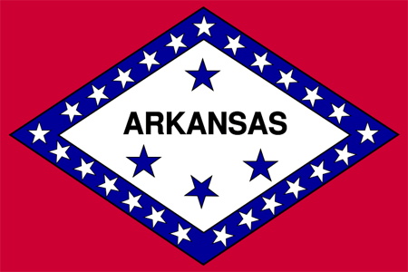
I hope I’m not about to offend anyone by saying that the flag for Arkansas (the winner of a 1911 design competition, subsequently revised over the next fifteen years) reminds me of the label of a sardine can. It’s a resolutely puzzling piece of design work – laden with stars distributed semi-assymetrically and apparently at random (there is meaning to them, but it’s a fairly forced meaning). I would say this was not an enormous design triumph for the state, and – given how new the flag is – quite possibly up for a redesign. Find out more about the flag of Arkansas

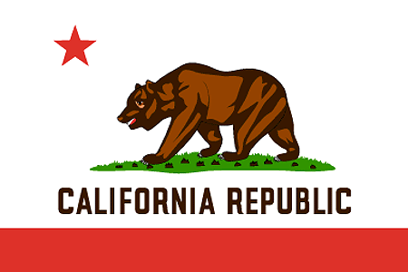
Now I have to say I pretty much love the California State Flag, even though it doesn’t really seem to me to particularly capture the spirit of the state that I know. It’s clearly reasonable solid on design grounds, but I think it’s history gives it a character that some other state flags don’t have. A much much simpler version of the flag was first flown during the Bear Flag Revolt in Sonoma (a beautiful town I’ve visited a few times on online community business). The revolt came about when U.S. Army Captain John C. Frémont persuaded the locals that the current Mexican government of California was about to attack them. Years later a revised version of the flag was adopted by the State. The original flag was in fact only flown for a couple of weeks before being replaced by the flag of the United States by officials of that power. However, the flag survived up until the great San Francisco earthquake of 1906 and in pictures appears to be a hand-crafted, rather clumsy but quite beautiful piece of cloth. The current design is a quite substantial reworking of that flag. Both versions feature the bear, which apparently was nicknamed Cuffy by Midshipman John E. Montgomery.

As a composition it seems to me to be pretty solid – the red stripe at the bottom gives a flag-like feel and a grounding to the work – with the star at top left balancing it all pretty successfully. The bear has been pretty well stylized and the grass doesn’t seem too forced. It’s all pretty solid. Even the font on the flag seems to fit quite well. American state flags seem to have an unusual amount of writing on them. Normally it’s a disaster – but not here. In fact the only thing I’d say about the flag that troubles me a bit is that its revisions from the original have maybe left it a little too airbrushed and carefully branded. Find out more about the Flag of California

I’m going to stick my neck out now and say that I think Colorado’s state flag is the worst flag of all the US States, and I’m going to put this down squarely at the doors of design amateurism. Apparently none of the colours or the shape of the ‘C’ were fixed by the legislature for decades after its original creation. Bad branding! I’d fire that particular agency in a moment. There’s also an alarming lack of meaning to the thing. The blue apparently represents ‘sky’; the white, ‘snowcapped mountains’; the red, ‘earth’ and the yellow represents the sun. If it wasn’t for the ‘C’, therefore, this flag could cheerfully be used to represent pretty much any country in the entire world. In fact, to me it looks more like a bad corporate logo – perhaps for Carolco or something – than a State flag. Bad form, Colorado. Very disappointing. Find out more about the Flag of Colorado

In terms of bizarre flags, Hawaii takes the biscuit. The flag officially predates most of the states in America itself and in its semantic cross-breeding gestures towards some of weird compromises in the state’s history – apparently representing an attempt to hybridise the flags of the UK with the US. That Hawaii still flies a flag with the Union Flag of Britain in the top left corner is – frankly – a bit weird. And given that the Union Flag is already rather overloaded with design elements and meaning (being itself a hybridisation of the flags of England, Scotland and Ireland), Hawaii never really had a chance… Find out more about the flag of Hawaii

Among the people I’ve shown it to, the flag of Maryland triggers really dramatically different responses. Some find it headache-inducing, but I absolutely love it. In design terms at least it’s totally distinctive and stark and sort of beautiful. Historically, it’s a bit more troubling – apparently being based upon the heraldic banners of George Calvert, 1st Lord Baltimore. There’s a twist though – originally only the gold and black elements were used for the flag until the Civil War, when secessionists chose to represent themselves under the red and white colours. After the Civil War, the flag was changed to represent both halves of the struggle. Find out more about the flag of Maryland

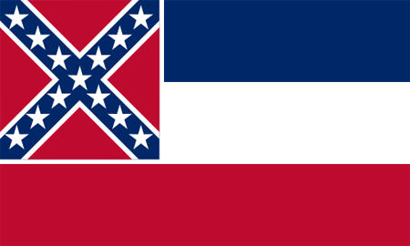
This is the flag of Mississippi. It is, I think, rather a clumsy design effort centred around the ‘stars and bars’ of the Confederate flag. The square in the corner is clearly a different aspect to the flag itself which makes the thing look inbalanced – particularly with the diagonal lines in it. The white surround to the square confederate design is also a design compromise to allow it to sit next to the red bar without a weird bleed. It’s just clumsy clumsy clumsy. In 2001 a replacement was proposed which replaced the Confederate cross with a series of circles of stars. The replacement was – I think – a significant improvement – disposing of the diagonals for one – and looked more balanced and mature. It’s still far form a beautiful bit of work, but that’s sort of irrelevant since the replacement flag was firmly rejected by politicians of the time. Find out more about the flag of Mississippi

The flag of Nevada troubles me a bit, mainly because of the large slogan, “Battle Born” stuffed unceremoniously in the top-left hand corner. This is supposed to reflect that the state was created during the Civil War, but seems to me to be the kind of thing that could encourage your citizenry to confuse aspirations of solidarity with violence towards outsiders. Seems to me that flags should help you aspire to something rather better than fighting. Design-wise it struggles with fonts and writing like so many of the US State Flags, but at least it does so more discreetly than some of the others. Find out more about the Nevada State Flag.

Now this is a classy flag – simple, elegant, modern and reflecting the history and people of New Mexico. Or at least so it would appear at first glance. The symbol in the middle is a sacred symbol of the people of the Zia pueblo and represents the Sun. That would probably make you think that the flag was a sensitive representation of the indigenous peoples of New Mexico. Unfortunately, given that the indigenous peoples of New Mexico are desperately trying to get their symbol off the flag, that’s probably not the case. Still in design terms, I think it’s a triumph – simple, elegant, stark clean colours suggesting the atmosphere of the place. All very interesting and well put-together. Find out more about the Flag of New Mexico

Now this is a strange one – the flag of South Carolina – that I’ve put up mainly because of the weird associations that it triggers in my mind. At first glance it seems like a picture of a palm tree and a crescent moon, and I’m afraid that immediately triggers thoughts of Middle Eastern flags to me. I’m not the only one, it seems. In terms of symbolism there are a whole bunch of articles online about how the crescent moon came to be associated with Islam. I can’t quite imagine South Carolina as an Islamic state though. A little more digging reveals that it’s supposed to represent not the moon, but some form of neck armour. Problem solved, albeit in an odd way. Find out more about the Flag of South Carolina

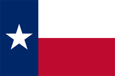
And my final selection is the flag of Texas. It’s difficult to know what to say about this flag, except that it’s solid, representative, strong and pretty much perfect for the state it represents. It’s not flowery or over-designed, it has blunt and solid symbolism (blue reflects loyalty, white reflects strength and red, bravery). As such, despite the other more florid, elegant or stylish flags from around the country, I have to say that I think this is the most successful. Find out more about the flag of Texas

If you’ve enjoyed this tour around some of the strangest and best of American State Flags, you should really explore them all on Wikipedia’s Flags of the US states page. You’ll notice that there’s a wide tradition of flags with scenes in their centre and latin proverbs. Unsurprisingly these represent most of the older and eastern states of the US. Of the flags I’ve not talked about, I think perhaps Alaska is my favourite.

Categories
Design Net Culture Technology

The RCA Summer Show 2006…

Once a year the RCA Summer Show opens its doors – showing over six weeks off all the incredible creative work that its students have created across all their disciplines. The show comes in four main parts, three of which have already come and gone – so if you’re interested in scultpure, fashion and most of the fine arts, then I’m afraid you’ve missed out. But the fourth session – the one that I’m most interested in – just started yesterday and runs until next Sunday. If you’re in London over that time and are even vaguely interested in the future, in design or whatever, then I can’t recommend it enough. It covers a whole bunch of disciplines including animation, architecture, communication art & design, conservation, curating contemporary art, design products, fashion, history of design, industrial design, engineering, interaction design, textiles and vehicle design. I’ve emboldened the disciplines that I got rather over-excited about this year. The Interaction Design course is sort of the equivalent of the ITP course that Clay Shirky is involved with and which gets a lot of play in the US at conferences. The UK crew don’t seem as well connected. Maybe we can change that.

Anyway, I thought I’d write a post in which I talked about some of the things I spotted this year which I thought were the most interesting or exciting. To be honest, I’m mostly interested in things with clear real-world applicability, but every so often something that looks more like an art object gets me excited. If you’re interested in the first batch, there’s a fair amount at the show which could be productised and brought to market pretty quickly, and if you’ve got some spare cash, I’d really recommend throwing it at the people concerned as soon as possible. But before we get ahead of ourselves:

Very disappointing, and I’m afraid to say in a couple of places – normally (but not universally) with the permission of the designer or creative person concerned – I have slightly transgressed. If I couldn’t get permission then for the most part I’ve wandered over to their sites to get imagery and background information or scanned in information that they put out for people to take away. Unfortunately not all of them have good websites full of information, which is where I’ve gone off the rails a bit. A good proportion in fact have nothing but an e-mail address or a registration page on the web – even though the web address is on all of their cards. Quite bad form that. Very disappointing. Case in point – stand up and apologise to the group, Larissa Nowicki who made some very awesome things, none of which I can point to. But I can point to:

Availabot by Jack Schulze: Quick conflict of interest declaration – Jack Schulze is a friend and co-runs Schulze & Webb with Matt Webb, long-time blog-friend and ex-BBC partner. Point being, I may be biased – but this seems really neat to me. Availabot is a tiny representation of one of your friends that spends most of its life flat on its back but stands vigorously to attention when your friends appear on IM. They’ve written a bit about some of the nicest features on their site:

“Availabot stores the IM details of the friend it represents in the puppet itself. That means you can buy a few, load them with your own IM screenname and service, and give them out like business cards to your closest contacts.”

I’m totally loving this, and just wish wifi tech was further along so that you could have them littered unwired all across your home. At the moment they use a USB connection, which is still pretty sweet. I would certainly buy a few, even though they’d be even more awesome if they were able to store a short message in the person’s voice when they activated. You may recognise that the availabot in question here is a representation of Matt Jones:

Jack had another project on display at the event – an appliance that allows you to melt and reform the case of a mobile phone using eutactic metals. It’s difficult to explain, but it’s a beautiful piece of engineering:

Natural Deselection by Tim Simpson: I absolutely loved this idea – three plants compete to reach the light that feeds and nourishes them. The first one to succeed survives. The other two are automatically cut down in their prime:

I wish I could show you something of his other project Subversive Sightseeing which took a kind of augmented reality approach to the most public of tourist traps – the public telescope. He’d taken this coin-operated telescope and replaced the actual view with a digital image. As you panned across in either direction with the telescope, the image changed too – making it appear like your view was uninterrupted. Except that then he animated various fantastic events over the view – like Big Ben erupting into flame – which would draw you out of reality and into fantasy. Glorious bit of art humour. And nothing to show for it online. It’s as if it didn’t happen.

Singing Sock Puppets by Matthew Brown: Absolutely my favourite of the whole event – tiny glove puppets that look a bit gormless that sing in isotonic scales to jazz records, with the user choosing the pitch by how open the mouth is. It sounds dumb, but it’s the most fun I’ve had with a sock and some electronics in years. There’s some great stuff on Irvinebrown.com about this project, including a whole part of his portfolio dedicated to the singing puppet project complete with links to videos of prototypes: Durrel Bishop (1.5mb) and Brigitte Lelievre (2.3mb). He’s already been linked to by We Make Money Not Art, which is probably a good sign. Here’s a picture of Simon looking slightly over-playful with a puppet:

Bonsai Tree by Jennifer Chan: Bloody lovely this – it’s sort of a cube of rapidly manufacturable and easy to craft plastic material that you can take home and massively personalise to your whim. I imagine that some people would produce absolutely beautiful shapes, while others would product crap, but the concept alone is extremely beautiful. There’s more information about this project on jenniferchan.com – although unfortunately it’s all skanky frames so I can’t actually link to the specific project in question. This picture is from that site:

Liquid Orange by Graeme Davies: At the event I saw a whole bunch of videos of the experimental design work that went on around this concept, but I didn’t actually get to see the thing in action. The concept is really simple – something that you stick inside an orange that liquifies it from the inside giving you the freshest of orange juice with limited washing up:

Flying Fish Bowl and Bin Bag Bear by Shay Alkalay: Shay’s another one of the design crew who is poorly represented online, keeping his work hidden from the largest constituency of interested people in the world. And it’s a shame, because meeting him at the event he seemed a little more nervous than some of other designers but actually extrememly talented. The fish bowl was extraordinary and actually mentally challenging – a transparent ring-shaped object like a donut full of water attached to the wall rotates very slowly. It’s only about a third full of water, and industrial buildings cast in white plastic slowly move through the water, blowing bubbles aerating it. One side of the ring swells out a fair amount so that when the water reaches that point, the water level drops, meaning a gap in the inside of the ring that looks like it would cause all the water to pour out, just narrowly clips by without a problem. I found this completely fascinating – you sit there wondering about whether the fish is experiencing this as a pleasant experience and start thinking about cats sticking their paws in. An object that makes you try and contextualise it and think around it.

But it was his other project that I got completely excited about, and wish was in the world. And it’s easiest just to show you than to explain:

Anyway, there’s a bunch of other things I wish I could show you – including the 11 walking sticks that Jonathan Legge created out of random sticks of Hazel found in the forest, to Gen Suzuki’s extraordinarily simple but beautiful ‘oblique’ vases and chairs. Unfortunately none of these people had information on their sites that I could reference or nick. Definitely worth looking out for them though! In the meantime, all of this and more can be seen at the RCA until Sunday – and I’d be fascinated to hear what you lot liked or didn’t like about the event. I can recommend some of the shapes in the automotive design section. They’re extraordinary.

Categories
Design

People-watching at the RCA Summer Show…

Spotted at the RCA Summer Show (which I will be writing up more fully in a bit) a rather stroppy looking woman with an accent wandering around between each product on display demanding to know how much each of them were and when she could buy them. Most of the designers looked completely confused by the questions, particularly given that it was the first day of the event and they clearly had all of their creations on display. When the designers protested that they weren’t selling things on the spot, she demanded to know who made them, who was responsible for their creation and when she would be able to buy them. I found the whole thing completely fascinating, both as a little microcosm of cultural differences in action (the woman clearly thought it completely appropriate to be highly aggressive and business-minded at the event, the designers clearly found the whole thing mortifying) and as an indication about why British business might not be quite as agile. I couldn’t imagine the same awkward conversations in the US.

Wandering around the event, I also got a sense of how the designers viewed most of the people wandering around. I overheard a couple of conversations between designers in which they talked about how weird it was that they’d spent months working up to this day for people to just wander around and prod things or walk past dismissively. And I almost got into a fight with a guy who seemed to think that I’d put down the headphones on one display too aggressively. It must be an incredibly tense situation to find yourself in – an amazing opportunity but also one ripe for conflict. It’s a pretty high level to find yourself pitching your work, and all I can say is that the people concerned really seemed to rise to the challenge in their creation, even if they were a bit inexperienced at dealing with the mechanics of the event itself. I found myself wishing that I had the time and flexibility to go back and do a course like the Interaction Design course that Jack’s been doing. That level of creative freedom looks amazingly sexy, even though I have a sense that it’s not a space you’re supposed to have too many chances to pass through – and that maybe my time is up…

Categories
Design

Yahoo! launches new beta homepage…

One small aside that I should probably bring to people’s attention (and get some feedback on) is the new Yahoo! homepage (Yahoo! UK version) which has launched in beta. Richard MacManus of the awesome Read/Write web has a good review of the changes to the page. There are a few little things I’m unsure about, but they’re basically trivial compared to the many significant improvements that have clearly been made. I’m interested to know what everyone else thinks:

Categories
Design

More del.icio.us visualisations…

A while back I received an e-mail by a guy called Kunal Anand asking about whether he could get his mitts on the raw dump of my del.icio.us data to work some visualisatory / processing magic upon. I sent him the data and stuck a dump of it online for the rest of you people to play with, and then promptly forgot all about it. Then I went to America for a month and my Inbox filled up with immeasurable amounts of stuff that I’m still now ploughing through. And today I’ve stumbled upon the visualisations he completed, and they’re pretty beautiful:

You can also see the larger originals here and here should you be interested. Now all I have to do is work out exactly what they’re representing. I’m going to write back to him straightaway and ask!

Categories
Design

On tiny, beautiful, little business cards…

I’ve always wanted to get some sexy plasticbag.org schwag made and now I have some! And even better than that, soon it won’t just be people like me (the successful, the sexy, the preternaturally flexible) who can get their hands on such a beautiful display of tiny, variable and personalisable goodies. A friend and ex-colleague of mine is sneaking around behind the scenes at the moment trying to get this kind of stuff available to the masses. I’ve been sworn to secrecy in the meantime, but it’s totally awesome and I’ll post more about it when they’re ready for a little more of a public appearance. In the meantime:

Categories
Design

Yahoo open up their UI libraries…

I don’t often write about places where I work, but this is a happy exception. Yahoo have massively extended the already pretty terrifyingly impressive Yahoo! Developer Network with a whole foray into design patterns and client-side technologies. So first you’ve got the Design Pattern Library, with information about mostly pretty reasonable techniques for handling ratings and reviews, navigation, breadcrumbs and the like. Then you’ve got the User Interface Library full of useful JavaScript components for drag-and-drop, sliders and tree views, the Graded Browser Support Guidelines and the Yahoo! User Interface blog which will feature, “News and Articles about Designing and Developing with Yahoo! Libraries”. Where appropriate it’s all been released under pretty reasonable (some might say excessively reasonable) licenses. I’d really recommend that people check this stuff out – YDN are one of the parts of Yahoo that regularly get me excited.

Categories
Design Navigation Net Culture Social Software Talks Technology

My 'Future of Web Apps' slides…

Right then. My slides. I’ve been trying to work out the best way to put these up in public and it’s been more confusing than I thought it would be. Basically, the slides are so Keynote-dependent and full of transitions and weird fonts that it would translate very badly to Powerpoint – and with no one having the fonts, the presentation would look pretty terrible anyway. So I’ve decided to put it out there in two forms – both simple exports of a slightly adapted version. If you want the PDF it’s here: Native to a Web of Data (16Mb). If you’d rather view it online directly, then I’ve used the export-to-HTML feature (which I’m beginning to suspect might kind of suck a bit) to produce the likely-to-crash-your-browser-with-its-hugeness Native to a Web of Data.

The biggest question I’ve been asking myself is whether or not it’ll make any sense as a standalone presentation, and i’m afraid to say that the answer is sort of. Without my notes there are great chunks where I’m afraid you’ll have to make pretty substantial leaps to keep the thread of the thing, which is hardly ideal. What I should really be doing is writing the thing up in a more logical thorough and coherent way, but I’m not sure I’ve got the mental agility to do that at the moment. So enjoy it in as much as you are able and I’ll think about writing it up over the next few weeks.

As usual I have to preface all of this stuff with the normal disclaimers. The views presented in this presentation do not necessarily represent the views of my employers.