Categories
Design Navigation Social Software Technology

On Metafilter's folksonomic subdomains…

I’m going to move on quite quickly back onto something way way less embarrassing and mainstream back into the boring semi-beating heart of one of my pet work-related fetishes, the folksonomy. In particular I thought I’d talk about a new development over on Matt Haughey’s Metafilter, written up on Metatalk. Each post on Metafilter can be tagged folksonomically by its author when it’s created – so when I write a post on trees, I can add a few keywords like trees, plants and leaves to make it easier for other people to find them later. What Matt has added recently is a different way to get nice easy to browse sharded versions of Metafilter by making it possible for people to use tags as a sub-domain. So for example, now at tree.metafilter.com is a kind of ‘treefilter’. And at plants.metafilter.com is ‘plantfilter’. And so on…

My first reaction was extremely positive – I think it’s a great idea to help Metafilter serve more constituencies to provide what amount to multiple homepages. And I love the idea of using tags elegantly to create new ways to browse around and explore sites large content sites. In fact a few years ago I spend a fair amount of time hassling Matt to start regional metafilters for people of different cultures and backgrounds, arguing for a version of the site for the UK or London or a On Regional Metafilters and Matt Haughey wants me dead). This tag format makes that actually practical – there actually is a uk.metafilter.com now and a europe.metafilter.com. And it’s interestingly extensible in all kinds of neat directions.

But there’s something troubling about it for me, and I think it’s the idea that now a single thread on Metafilter can have a great variety of URLs. The current top thread on europe.metafilter.com is called Sieg Whaaat? and it’s URL is europe.metafilter.com/mefi/48225. But now, suddenly, it also has twenty other URLs including germany.metafilter.com/mefi/48225, berlin.metafilter.com/mefi/48225 and music.metafilter.com/mefi/48225.

Now I know that various search engines can compensate for content displayed the same in multiple places, but it’s got to affect Google rankings or any solid concept of one addressable web-page per resource on the internet. And even if it doesn’t affect the big players too much, it’s inevitably got to screw up all the other smaller services that use URLs to identify resources. How will Technorati or del.icio.us handle this stuff now? How will you be able to aggregate annotations or comments upon a thread in Metafilter in a coherent fashion without making it some kind of special case?

It’s such a shame really, because there’s a hell of a lot of potential here. Really what you want is some way to make these homepages as useful as they are without carrying the URL structure through into the individual thread pages. It seems clear why he hasn’t done this, of course – if you want to keep someone within a conceptual sub-site like gardening.metafilter.com then you have to change all the links contextually around the page to make it seem like a coherent site – on the destination pages as much as on the indices. And that means either some form of cookie-like approach that keeps track of how you found a link, or something in the URL. The former approach doesn’t work so well because it means that you can’t easily send someone a URL and be sure they’re seeing the same thing you saw. You might be recommending a great page on a site about gardening, only for them to see it as a generic and intimidating entry on Metafilter central. The latter approach creates URLs that either proliferate versions of the same page, or are full of query strings (which are somehow less definitive in their addressing of a page).

All in all then, I applaud the intent a lot but think the implementation is profoundly broken. Unfortunately I can’t think of a solution.

On a related note, though, the whole tagging thing is starting to get me really excited because it kind of makes whole database schemas quick to upgrade and you can add loads of fascinating functionality really quickly. Imagine, if you will, that any thread started in a sub-domained area includes (by default) the tag for that area. It doesn’t do this at the moment, but it could do so really easily and could start generating nice feedback loops.

Or take it in a completely different direction – get rid of tags from the subdomains and instead put in tags that represent languages. So you create a form of tags which operates as a key:value pair with a code something like lang:english or lang:francais and then present a default English homepage to Metafilter with links to english.metafilter.com and francais.metafilter.com on it. You then encourage people to post links in French on the latter one, and automatically tag each of their posts with lang:francais as you do so. This would create real meaning in the subdomains and would keep the URL space nice and tidy. To browse a sub tag then, you’d have a URL like http://english.metafilter.com/tag/iraq, with all the threads within that area given URLs like http://english.metafilter.com/mefi/34566.

Categories
Design Technology Television

Eagerly awaiting an Apple Media Hub…

While I’m on a roll and getting all my wanted-to-post-but-didn’t-have-time stuff out in public, I thought I’d just put out my stall again with regards to what I think an Apple Media Hub should be like. With MacWorld only three days away, it’s really back on my mind again.

Let’s start off with a couple of links: A really rough proposal for an Apple Media Hub (Part One) and Part Two. There’s a separate page including some illustrations as well, with larger versions of images like these below:

And if that’s not enough for you, and you need more stuff about television and set-top boxes, then you should have a glance over at my pieces on Social Software for Set-Top Boxes, Future Developments in Home Media Centres or in the Television category of the site. Ooh, and an added little extra – I just found my old rather rubbish attempt to do a mock-up of an Apple Set-Top Box in Illustrator. It’s not great, but hey…

Should a new media centre from Apple not be announced, then I’m totally going to get myself an iMac with Front Row and a remote control to replace my ailing PowerMac. But I can’t help thinking that there’s almost inevitably going to be something in this territory. They’ve got such a great head-start with the iPod that I can’t imagine they wouldn’t try and extend themselves around the rest of the home. Whatever happens, I’ll be glued – as ever – to the rumour sites and IRC channels on Tuesday evening UK time. Hopefully I’ll see some of you in them…

Categories
Design

On the clumsy milking of mass amateurisation…

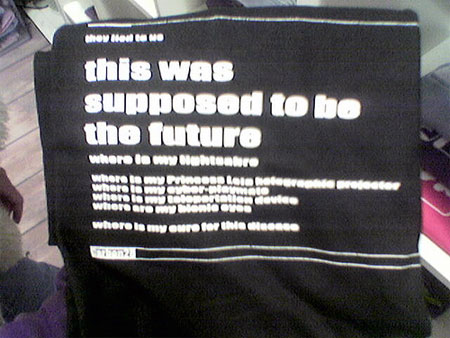
It’s reading all this processed text that gets me so backed-up, I’m sure. I need a webloggic irrigation to get the flow back. But at the moment, every scant fragment is a movement in the right direction, so I’m going to start with this little tiny observation. I’ve talked before about mass amateurisation and how larger companies are spotting the creative activity that’s bubbling up from the newly empowered masses. Sometimes, of course, these larger companies don’t always operate as scrupulously as they might. So I was out the other day with Mo Morgan and his lovely lady, and we spotted this in a highly-designed expensive-looking shop called Carbon 28 on Neal Street in London:

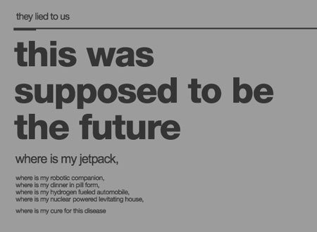
It’s fairly entertaining, I suppose – there’s something about Princess Leia holographic projectors in there and light sabres and bionic eyes. It’s just a shame it’s a reworking of the rather well-known, rather funnier and rather better printed shirt on Threadless. Now I don’t think there’s anything illegal about this – the two shirts are different enough from one another, and you could probably even argue that the Carbon28 t-shirt is a parody of the Threadless one. But it’s… disappointing… you know? Cheap. Clumsy. Inarticulate, inelegant and tawdry. We should be doing better by each other.

Categories
Advertising Design Humour

BP adverts look just like my site!

About a month ago I was watching television and an advert for BP appeared and goddam did their new advertising aesthetic look like my site. Now I’m not seriously suggesting that they ripped off the design of my site, but the synchronicity is pretty astonishing – particularly given that plasticbag.org used an exclusively yellow highlight for a few months early on. I tried to take a picture of the TV at the time, with no success (lots of banding and stuff) but last night I was on an escalator in a tube station and stumbled upon a huge block of billboards. And here are the pictures:

So it’s all quite funny and entertaining and everything. We’re clearly all meshed with the same zeitgeist or whatever, but in the spirit of accidental crossovers (particularly given the acronymic similarity between BP and PB.org) and inspired by a comment by Mr Paul Hammond, I’ve remixed their logo in return to make it fit with the various plasticbag.org colour schemes. Maybe I’ll use it as a logo for a while sometime in the future… Hopefully they’ll see the joke and won’t sue me or anything:

Categories
Design Navigation Radio & Music Social Software

A quick review of Yahoo! Podcasts…

Double disclaimer time here – firstly I’m knackered and what follows is badly written and I will edit it later for clarity, punch and drama. The other thing is that – of course – the viewpoints represented here do not necessarily reflect those of my employers (the BBC) who may be much much more intelligent than I.

A few short months after iTunes installed a podcast directory and client comes Yahoo! podcasts, and frankly I think Yahoo are more on the money with this one. The current implementation is a bit clumsy, it’s true – there are loads of things wrong with it – but fundamentally they’ve got the idea that podcasts should be linkable, that social media navigation is fundamentally important and they’ve got that creating a platform for amateur creativity is going to be the thing that really demoncratises the medium and changes audio forever. In this – as in so many other things – they’ve taken a huge lesson from Odeo, which remains the best service on the net (and will blow people’s heads off when they launch their create tools please god sometime soon.

I wrote an enormous post about Odeo a while back, which I never published after a friend said it was ‘a little hyperbolic’. That post contained much of my thinking about the evolution of podcasting and why it was so important (and why Odeo had got it so right as far as it had got so far). I’ll dig that up later and try and get it up by the end of the day. But in the meantime, I thought I’d write a little bit about the design and implementation of podcasting on the Yahoo service (with occasional reference to some stuff that Odeo have done).

The big problem both services have is that they don’t own the audio clients that people will use to listen to (and probably download) podcasts. This unfortunately leaves iTunes with the most seamless (if truncated) experience. Odeo finds some ways around this. Yahoo! Podcasts doesn’t. The problem really is in the web interface elements. You want to be able to subscribe to a show with just one web-based click and have that be reflected with a download to your client-side audio player. Yahoo don’t even try to solve this problem, which brings us the first major problem with their product – the subscription process is a multi-stage horror of downloaded podcast files and double-clicking. It is, frankly, clumsy as all buggery. Odeo’s syncr app is a much more elegant solution – a small client through which you login to their site, and which then downloads your ‘queue’ of episodes. But Odeo’s app still has its problems – much of the great functionality of iTunes is concerned with deleting old episodes and with handling how many shows remain on your iPod. Odeo’s approach makes it harder to use that functionality.

What we really need, it seems to me, is some form of OPML-style file that a client can subscribe to that contains a collection of podcast feeds. The list of your subscriptions (in whatever appropriate format) could then be updated by web clients around the web and have that reflected in your podcast client next time it updated. I don’t know if anyone’s working on that kind of stuff. If you know anything, let me know…

So what else is going on with the Yahoo! podcasts service? Well can I just say to start off with how nice it is to see a Yahoo service that isn’t plain white! If this is a beginning of a trend for their more lifestyle / entertainment brands, then it’s something I’m in favour of. Obviously I’ve seen Yahoo Music before – but this seems to me to be a much more elegant solution – a simple top navigational structure that keeps the Yahoo brand but which could be colour-coded to represent different Yahoo products.

The rest of the page is a bit … busy … though. It’s the same problem I have with the Yahoo homepage actually – there’s just too much damn stuff on it. Or at least (in this case) there’s too lines and gaps and bits of black. It is – however – far from terrible and has take a lot of the lessons from Odeo’s implementation of subscribable programme blocks (complete with preview functionality). It’s just a bit inelegant, and doesn’t have the sheen of an iTunes or an Odeo. But generally, it’s far from sucky. Mostly well done!

One final thing I want to talk about is the implementation of tags. I think this is something that they’ve fouled up – although in this case slightly less than Odeo have. Both services allow users to add tags to describe shows, but neither builds in any impetus to do so other than pure, good-hearted altruism. The individual doesn’t bookmark or collect the shows in question, they just write stuff. There’s little or no (enlightened or otherwise) self-interest being met, and as a result I think it’ll probably fail.

The problem really comes in trying to derive value from the interactions of hundreds or thousands of people. The first rule is that the individual needs to see some value in what they’re doing (ideally personal value). It’s unclear what that value is in either Odeo or Yahoo’s implementation. But the second rule is that you should be able to aggregate individual interactions to create something bigger than the individual. Odeo gets this completely wrong – a show can be given a tag, but only one of any given tag. A bit of metadata that a thousand people think is useful is given the same conceptual weight as a bit of metadata that only one person thinks is useful. The end-result, an easily spammable system with no sense of weighting that could make searching or ranking results easier.

Yahoo tries to fix this by making it possible for a show to be tagged multiple times with the same term, but doesn’t give any clear explanation to people why they should tag a show with a word it has already been tagged by. And because there’s no obvious reason to retag something with a pre-existing word, and because there’s no value to the individual to undertake that tagging other than altruism, I can’t believe it’s going to be enormously successful.

What they need to do instead is think about a generic implementation of tagging (and a representative user interface widget) that a logged in Yahoo user can carry with them around all of their services, showing how an individual search result or review or news story or web page or podcast has been tagged by them personally (and making each tag a link off to browse their annotated collections of stuff), as well as showing the aggregate. That would make much more sense, and could be much more powerful.

Categories
Design

On redesigning icons, Superman and politics…

So it’s a rare week that sees me talking about the redesign of two icons – but with both Superman and The Guardian fighting for the little guy in brand new outfits, I couldn’t really not comment. My first reactions to theguardian‘s redesign – now that I’ve seen it in the flesh – are almost uniformly positive. But I think I’ll write about that more thoroughly later in the day when I’ve really had time to get my head around it. In the meantime, I don’t think you’ll find a more detailed or painstaking or (well) longer analysis of the whole thing than Dan Hill’s piece: Assessing the new Guardian, with brief nod to the avant-garde (aka Grazia, Heat and The Sun). Aggravatingly, he’s even thought to place the front cover on Flickr and annotate the bits he thinks are particularly interesting. I wish I’d thought of that. Maybe in a couple of days I will have done.

Anyway, despite the evident interest that everyone has in the Guardian, this post was about that other subject that no one but me appears to care about – the redesign of the Superman “S” logo that I wrote about earlier in the week. I can’t quite figure out why it hasn’t got the design / typographic community frothing in their lattes, but I guess that can’t be helped. I’m still fascinated by the cultural associations and design history of this particular logo. I can’t remember who said that decades alternated between ‘Batman’ decades and ‘Superman’ decades, with the popularity and reclamation of each character following cultural trends and cultural optimism, but it’s hard to deny that it’s true. The world of comic books in the eighties was dark and mercenary, the nineties optimistic and bright, and the most recent decade has seen an enormous swing towards darker stories and a more interventionist Dark Knight politics. What’s interesting to me then is how the evolution of Superman reflects these changes, how our delight in – and suspicion of – the idea of a super-powerful alien is reflected in the way his design is treated.

All of which is a pretext to link officially through to a site dedicated to the evolution of Superman’s “S”. And that link is itself a pretext to reproduce this image from the site, showing an enormous range of logo variation, way beyond the simple changes I indicated in my last post:

Categories
Design

Looking forward to the new Guardian…

So the big typographic / design story of the moment should be the redesign and resizing of The Guardian. But, I have to be honest, most of the design sites I normally visit don’t seem to be talking about it at all. The first newly-designed issue comes out tomorrow, and the last redesign was one of the most controversial and revolutionary of the last fifty years. You can see a version of the cover and a set of features about the redesign over on the Guardian’s site. I’m particularly excited about this after going to see an exhibition on Newspaper design a year ago (see the Flickr set) with Matt Webb, Phil Gyford and the rest of Map Club. After a few presentations, a discussion started about the Guardian’s move to the Berliner format. A year later, we’ll get to see what it actually looks like.

From the digital images I’ve seen so far, though, my initial impressions are mixed. I’m quite excited about the size and format changes and the typography sounds fascinating. I’m not completely convinced by the all lower-case logo though – it seems to me to be a bit sexygirl153 and not really serious enough. A friend reliably informs me that in the whole sub-dom culture, submissives often write their names entirely in lower-case. She suggested that perhaps this gave the wrong impression to a paper that aims to be authoritative. I think she might have a point, and fear that the branding might play right into the hands of people who think it’s a woolly liberal publication for spineless school-teachers. But then I haven’t seen it close-up yet.

One thing I think might compensate for that image is the new advert they’re running, which really pushes the whole dynamic change idea as well as the size shift and the increase in the use of colour. It’s a great little advert and might push the publication out to a whole range of new potential readers.

Categories
Design

Type Challenge: Redesign the Superman logo…

I have more folksonomy-related posts coming, I’m afraid, but in the meantime I thought I’d point people in a completely different direction that’s almost nerdier if you can imagine such a thing – towards Grant Morrison and Frank Quitely’s upcoming All-Star Superman comic book series. According to a fascinating interview with Grant the book is an attempt to articulate the classic archetypical concepts of the world’s most famous super-hero in a refreshed modern way. The art fits the concept perfectly – I’m particularly fascinated by this posture-based take on why people don’t recognise Clark as Superman:

All of which leads me to a bit of a challenge. As part of this process they’ve done the unimaginable and taken another pass at the Superman insignia – which has to be one of the most well-known bits of typographic/branding work of the last century. Which made me wonder – how would a professional typographer or logo-designer push the shielded-“S” into the 21st century? Does anyone have any ideas? Anyone interested in pushing a san-serif modernist Superman? Comic-Sans Superman?

I’m not really the obvious candidate to get people thinking around this stuff, though, so I’m going to link to a few classy typography blogs and see if they’re prepared to pck up the torch and introduce the idea to some professionals – so if you’re interested in typography or design, can I recommend fontlover.com, typographica, daidala.com, Speak Up and Coudal Partners. Obviously, if the rest of you have a stab, feel free to link to your posts below, and maybe I’ll more formally link to the neatest ones or something.

For more on the typographic variations of Superman’s ‘S’ symbol: A dedicated resource.

Categories
Design Navigation Radio & Music Social Software

How to build on bubble-up folksonomies…

[This post takes up some of the themes that Matt Webb, Paul Hammond, Matt Biddulph and I talked about in our paper at ETech 2005 on Reinventing Radio: Enhancing One-to-Many with Many-to-Many. A podcast of that talk is available.]

A few days ago I wrote about Phonetags, an experimental internal service that we’ve been running inside the BBC which allows you to bookmark, tag and rate songs you’ve heard on the radio with your mobile phone. Now I want to talk briefly a bit about one interesting way of using folksonomic tags that we developed conceptually while building the system.

The concept is really simple – there are concepts in the world that can be loosely described as being made up of aggregations of other smaller component concepts. In such systems, if you encourage the tagging of the smallest component parts, then you can aggregate those tags up through the whole system. You get – essentially – free metadata on a whole range of other concepts. Let me give you an example.

In Phonetags, we allow users to bookmark, rate and tag songs. They do so for a combination of personal gain and to add their voice to the collective. But music radio shows can be loosely understood as a collection of songs, and music radio networks can be equally understood as a collection of shows. So if ten songs that are well-rated and tagged with ‘alternative’ and ‘pop’ are played on one specific radio show, it’s quite plausible to argue that the show itself could be automatically understood as being tagged with ‘alternative’, ‘pop’ and that it should be considered well-rated. Similarly if all the shows are equally tagged with ‘alternative’, then it’s likely that you could describe the network that broadcasts them as an ‘alternative’ station.

How you handle the aggregation up the chain is an interesting question. My first instinct is that you would aggregate all the tags for a song, slice off the top ten or twenty and then throw away the rest and all the quantitative information. Then you do the same for all the other songs played in a show, and then reaggregate to see which tags have been played over the most songs. The alternative would be to simply add together all the tags that people sent in during that timeslot, but I think that would skew things towards the popular songs that people tagged a lot and wouldn’t necessarily reflect the character of the show itself. But that’s up for debate.

Another, and perhaps more intriguing, way of aggregating tags up through a conceptual chain would be to view albums as collections of songs and artists as a collection of albums/songs. This would mean that from the simple act of encouraging people to tag individual songs you were getting useful descriptive metadata on radio shows, radio networks, artists and albums:

The upshot of all of this is that you start getting a way of navigating between a whole range of different concepts based on these combinations of tags and ratings. The tags give you subject related metadata, the ratings give you qualitative metadata and from this you can start finding new ways to say, “If you liked this song, you may also like this album, network, album or artist“. You can start to generate journeys that move you from network to that networks most popular songs, through to the best albums on related themes (or which conjure similar moods or associations even if they’re by radically different artists) and so on.

And because you have a semantic understanding of the relationship between concepts like a ‘song’, an ‘album’ and an ‘artist’ you can allow people to drill-down or move up through various hierarchies of data and track the changes in an artist’s style over time. For me, this is a pretty compelling argument that understanding semantic relationships between concepts makes folksonomic tagging even more exciting, rather than less so, and may indicate a changing role for librarians towards owning formal conceptual relationships rather than descriptive, evocative metadata. But that’s a post for another time.

Are there other places where this kind of thing could be applied? Well, off the top of my head I can’t think of anything useful you could do with photographs, but I think folder structures on web-sites could prove an interesting challenge. I’d be fascinated to see if it would be possible to find well-structured websites with usefully nested folders and to aggregate tags from the individual pages up to section homepages and eventually to the site homepage. A little over a year ago I wrote about URL structure we developed for broadcast radio sites at the BBC built on the Programme Information Pages platform which you can see in action on the Radio 3 site. The URL structure mirrored a formal heirarchy much like the song / album / artist one – except for episode / programme brand and network. I’d be fascinated to know whether you could get a useful understanding of what Performance on 3 was about by aggregating all the tags from each of the episodes contained within its folder, and whether aggregating still further up to the frontpage of Radio 3 would give you a good description of the network’s philosophy and approach. One for Josh at del.icio.us, perhaps?

Now it’s over to you guys – can you think of any other heirarchies or places where we could encourage the tagging of the smallest practical component part and then derive value from aggregating up the semantic chain? Could the same thing work for non-heirarchic relationships? Anyone?

Categories
Design

Three generated artwerks from Scribbler…

I’m still trying to work out what I think of all the things that happened yesterday. When I got home last night, I spent most of the evening watching Close Encounters of the Third-Kind and trying to distract myself with manageable jobs and activities that didn’t requite too much intense scrutiny. Today, I’ve been pottering around the edges of bits of work and elaborating on concepts and letting things fall out of my head rather than trying to attack anything too meaty head-on. So if you’re wondering about the tone of my posts today, that’s probably why…

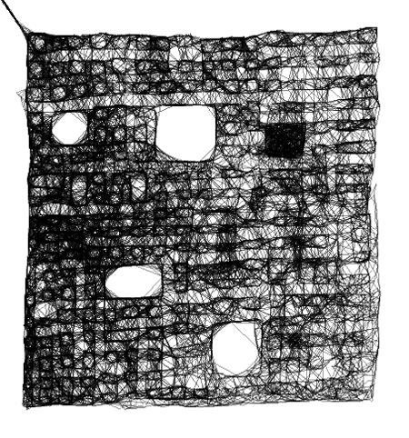
One of the things I did last night was play for the first time with Ze Frank’s Scribbler web art toy which I stumbled upon via draGnet. I found myself carving out and growing abstract spaces and shapes and then nuancing and rebuilding bits of them – like I was helping crystals coalesce or something. Here are the three that I came up with. They are all unnamed.

I’ve found using Scribbler such a therapeutic activity that I might go back at it again this evening. I can very much recommend using a graphics tablet with it, if you have that option. It’s so much easier to conjure curves and organic shapes with a pen than with a mouse or a trackpad…