Categories
Design

A life portrait for a business card…

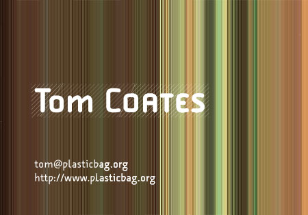
Awesome – after posting up my business card side effects of the plasticbag.org redesign, I got sent this terrific e-mail from Siobhan Curran of Tranniefesto:

A while back, I purloined a couple of images from your Flickr photostream, ran them through the processes that I use to make my photographic work, and ended up with what (in my mind anyway) is a portrait of you. Now, I hardly *ever* do this, but I thought, maybe, it would make n appropriate background for the business cards you mentioned today. You’ll most likely hate it – it has none of the transparency that you were aiming for – but I thought I’d send it to you anyway. Can’t blame a girl for trying…

Well I don’t hate it, I think it rocks, and I’m absolutely delighted that Siobhan sent it to me. And so I’m going to share it with the rest of you:

Categories
Design

Some side effects of the plasticbag.org redesign…

While I was doing the redesign for this site, I was trying to find an aesthetic that I could use in all kinds of other places as well. I experimented a bit during the process with some business card stuff that kind of didn’t come out too badly. As you can see, they’re a good deal more flowery than the rest of the site eventually became, but you have to strip back to rebuild (in design as in life). I think when I was doing these I was still pretty keen on acetate as a printing substrate of some kind. I hadn’t quite figured out how I was going to accomplish it though.

Categories
Design

On David LaChapelle, Selfridges and a Vegas Supernova…

Every day on the way to work my bus passes Selfridges. And from my elevated seat on the top floor, I get a pretty good view of the extraordinary themed displays that they put up each month. Sometimes they’re pretty rubbish. There was one about a month ago which had lots of ill-looking 70s-style mannequins posing uncomfortably against a snot green background. Around them were lots of fruit and vegetables. I think they were plastic. The whole thing made me feel a bit ill.

But for every failure, there’s a tremendous triumph. At the moment they’re running a Vegas-themed month in conjunction with some vile online gambling thing that I’m not prepared to link to. if you’re interested, they’re mention in the official website: Vegas Supernova.

The site is pretty well designed, but it really doesn’t convey the majesty of the thing. On top of the front awning is a huge neon sign that almost overwhelms the whole building, screaming Vegas Supernova into the night. It completely swallows any of the Selfridges branding, and sits surprisingly comfortably with the neo-classical architecture and the Art Nouveau sculpture. If you’re having trouble visualising it, try thinking of Biff Tannen’s Pleasure Palace from Back to the Future Part II. Yes, you’re getting it now. It’s that wonderful. I’m going to be so disappointed when they have to remove it.

Anyway, the best imagery is in the shop windows at the front of the store. They could have gone in a number of directions with this stuff – Vegas isn’t the hardest place to evoke. But rather than just push tackiness or spectacle, they’ve brought in David LaChapelle. His work is extraordinary, it’s almost as if Vegas itself is self-representing what it thinks is most important about itself – using only the plastics and artificiality and neon that it has naturally at its disposal. It’s almost an innocent portrayal of the place, as if the city doesn’t know that it’s kind of tacky and just wants you to like it.

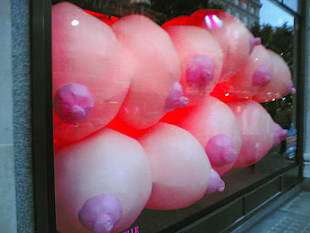
My favourite example of this stuff is the representation of the city’s sexuality – where the brazen display of breasts that Vegas is known for is abstracted and repackaged in plastic as windows full of inflatable breasts. Every so often they deflate a bit and then reinflate, pressing massive artificial nipples agains the glass. It sounds pornographic, but they’re made of such artificial and bright material that they look a bit like children’s toys. It feels like the city itself is going, “look at all my toys”.

The whole thing conveys an impression of Las Vegas that is as alluring as it is repulsive, as exploitative as it is extraordinary. It does this so elegantly. You look at the brashness and respond to its simplicity and eagerness – it’s complete lack of awareness of how slutty it is. And then at another level, you reel at the lack of self-awareness. Extraordinary.

Anyway, I can thoroughly recommend the whole experience, but if you want to see the spectacle for yourself, you’ll have to get down to Selfridges today or tomorrow before they start taking it all down. And if you’ve seen it already, why not let me know what you though about the whole thing by posting a comment below?

[These images are courtesy of Rebekah Ford, who managed to get much better photos of the orbs than I did. You can see more on her Flickr photostream. I feel I should also share one of her insights on the whole spectacle – that the inflatable breasts looked like they were about to burst through the glass in their thousands and start bouncing down the streets Prisoner-style. It’s an image I’ll take with me to my grave.]

Categories
Design

A few words while I switch the designs around…

Wow. Ouch. So there we go. I’ve redesigned the site and I’m struggling to get it all up and working properly as soon as I possibly can, but there are scratchy bits and clunky bits and I swear to got that I’m getting to those bits in a minute. This redesign has been a long time coming – and like so many of my personal bits of work, was actually accomplished only because I suddenly developed enough momentum on a Sunday afternoon to get it to a nearly thought-through stage before something else got in the way. So it has all of the features of things that come together in that way – I think it’s pretty inspired (for something I’d do), while simultaneously it’s full of rough bits that haven’t been polished out of existence yet.

I’ve been trying to think around my aesthetic and my reasons for going in this direction, but to be honest it’s a whole mix of things coming together at one point in time. There’s a bit of my general frustration with people doing things that seem to me to be working in opposition to the media, there’s a dash of my desire to keep refining an artificial/manufactured aesthetic for plasticbag.org and there’s a large stinking block of trying to strip away all the guff that has accumulated around my site over the last few years.

Weirdly, I think I’m also secretly hoping that by going so stark that people find the site intimidating and unfriendly. I’ve written before about how hard I find it to write when everyone’s watching. That feeling got a little worse than normal after the whole wonderful Bloggies win. Maybe subconsciously this is an attempt to try and keep a very particular crowd around here while alienating everyone else. Maybe it’s not so subconscious. Dunno. I guess we’ll see how people respond to it over the next few days / weeks / years.

Anyway, in the meantime, I’ll endeavour to get as much as possible (if not everything) fixed that appears currently to be broken in the next couple of hours, and maybe tomorrow I’ll try and give you guys a tour through some of my thinking. First redesign in a very very long time… Quite exciting…

Categories
Design

My vain search for a simple business card…

I have a strange request for help from you guys – the wider weblogging community – and it’s not terribly interesting, I’m afraid. I’m really enjoying the process of creating my new stark and simple templates for plasticbag.org and I’m also kind of obsessed with various elements of the typography and layout. My typographically snobbish co-worked, Mr Matt Patterson, isn’t quite so impressed by the work I’m doing – but I don’t care! I think it’s good!

Anyway, my newfound love for my site, my new simple clean aesthetic (which everyone will hate) and my long-standing desire to create some kind of weblog-related swag (as was the fashion a few years ago) leads me to a fundamental desire to get some weird business cards made, through which I can show off. Unfortunately, I have an incredibly precise vision in my head – and it’s of totally clear, square-cornered cards made of some substance like acetate. I want to place a few plain black words in a couple of fonts onto this shining piece of clarity and nothing more. But I can’t find anywhere in London that does anything like this at all.

So I’m appealing to you – my fellow aesthetes and egomaniacs – does anyone out there know where I can get something at once so simple yet brazen and showy as a thin totally clear plastic card? Please?

Categories
Design

More on the Warwick Blogs marketing…

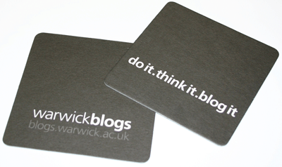
After talking about the awesome publicity surround the Warwick Blogs project the other day, John Dale sent me a link to the full design treatments. There’s some stunning stuff in there. As I said the other day, I think it’s the best block of publicity that I’ve ever seen around weblogs – it gets across the concept, the aspiration, the aesthetic. Very very classy. Here are a few samples to get you in the mood:

Categories
Design Radio & Music Technology

On trying to get an image right…

A long time ago during all the Warchalking palaver, I got interested in the idea of trying to find imagery that might convey they concept of an available wifi network to people. Warchalking obviously had its utility – it was a higher level, cultish concept designed to celebrate some kind of Ur-hacker / Urban-tech-frontiersman aesthetic. But alongside that was clearly a need for something simpler that your average punter might be able to get their head around. And when I say average punter, I do – of course – mean me, since I never actually figured out what all the little figures and abbreviations were supposed to stand for. I’m a clumsy, technologically backward Luddite. Sue me.

Of course now there are lots of little icons and logos and buttons – mostly proprietorial – that advertise the presence of wifi, so there probably isn’t the need any more. But at the time I had in my head some kind of image like the RKO pictures logo, but instead of beaming out lightning or pulses – it would instead be firing off packets into some kind of surrounding network.

Anyway, forever and a day later I find myself trying to convey an image of broadcast radio sets engaging with some kind of networked future in a useful way for a presentation and I return to the same image, and after an extraordinary amount of fiddling and arsing around come up with something fairly mediocre in execution, but interesting to me in terms of imagery…

You can download a larger version of the image here: Radio / Network hybridisation. So now I was wondering if anyone had any sense of how maybe to push it forward as an image? Or whether there was someone out there more expert in illustration than I who might be able to turn it into some kind of logo or badge or button. And – of course – I thought maybe it might be a good time to actually see if it makes any sense to people at all.

This is completely throwaway, though. Please don’t think I’m taking this terribly seriously. I just knocked it up while trying to do something else and failing and thought that it might have more value being exposed in public than just sitting on my hard-drive forever.

Categories
Design

Amazon's Top 10 Secrets of a Successful Website…

You’ll like this. Small post. Don’t really do so many of those any more, but this one has three links in it so I can’t stick it into del.icio.us. Oops. Four links. It starts with a little tiny post at Signal vs. Noise, the awesome 37signals weblog (dammit, five links):

“Is there any doubt that BIG is in? The signup button for Amazon Prime puts that question to rest.” (Big is in)

And when you click on the link you do indeed get a really really really big button. And the button has a bevel! And the bevel is big!

And I’m here to explain to the 37signals guys why this is the case, because although they’re all special clever-clever ‘we think we’re the shiznit’ usability people and all, they appear not to have read the seminal work on the subject – Jason Kottke’s classic 10 secrets of a successful website. It’s just as well that not everyone is so far behind the times though – I can say without question that Amazon have read this work because how else would they have known to implement Rule #10 of a successful website:

the bigger the bevel, the more important the button

Now people think Jason’s just a pretty face (jeez – six links… nngh) which is just so not true. For a start, it would be fairer to say that he was a pretty face, and not – I might add – that much prettier than me (it’s not the years, it’s the mileage). But more importantly, when he was a pretty face, he was a pretty face that also knew all about the web ‘n’ shit.

So look and learn people, and watch as Jason leads you through the future step by step – believe in him now or watch stupified as one by one his principles come to be employed in future Amazon.com designs:

From rule #4: 3D logos: “With today’s high end power mac 7200s and 486 pcs, one can create beautifully rendered animated 3D art that rivals the likes of that produced by pixar and industrial light and magic. why have a two dimensional logo when three dimensions are available? the extra dimension will make your logo stand out from those of your competition.”

From rule #6: CDRom on the web: “in the three years the web has existed, the web design community as a whole has discovered the one great truth: developing for the web is just like developing for a cdrom. you’ve probably heard different, but that’s just propaganda from all the techies that are mad because people no longer develop text-only pages.”

You know, come to think of it, you should write to Jason right now and get him to do an Amazon redesign that’ll really push them into the 21st Century! With his help maybe they can stop all this concentrating on business and so-called ‘classic design’ and really make something that sells their brand values instead!

Categories
Design Social Software

Towards tag-based bookmark management in web browsers?

So since playing with Flickr and working on a little fun project at work on (cough) folksonomies with Mr Webb, I’ve become obsessed with tags and the ways in which they can be used to build better navigational interfaces. Currently I’m interested in how we might use tags for better folder-less bookmark management in web browsers.

The way I see it, most people find the style of bookmark management commonly used in web browsers pretty much totally useless. Once you’ve added the two or three sets of bookmarks that you might use every day the bookmarks section of the web browser swiftly becomes very quickly a wasteland to which links may be consigned and never looked at again. After a while even the simple job of finding a URL that you previously bookmarked becomes so difficult that it is often easier to instead use Google to find the page afresh. Clearly there is something wrong here.

The most obvious thing that is wrong with bookmarks (other than that not enough browsers make them easily searchable) is that keeping them organised is an intensely complicated job. If you bookmark things regularly, it takes almost no time for your lists to grow to be hopelessly out of control. And then we’re expected to organise them into folders. But URLs and links can talk about any subject and can be categorised along enormous ranges of axes – they are much more suited towards databased organisation than they are the simple heirarchies that folders can afford. One URL will seem to fit into your ‘social software’ bin – but also would fit equally wellin your ‘do something about this URL’ bin, and perhaps should also be in your ‘relevant for latest project’ bin. Currently the only solution is to put the same thing in three separate folders – creating three bookmarks and no sense of how they relate to each other semantically. And putting things into multuple folders can be a slow and flow-disrupting process.

To summarise the problems with current bookmarking systems then, we could say that (1) the process is slow and annoying (2) that it requires us to continually refine and redevelop our taxonomies if we’re going to keep track of everything, (3) that URLs can belong in a number of bins and that (4) we can be left with unmanageably large lists. An ideal system would therefore speed the process up of both bookmarking a site and retrieving it later. An ideal system would try to alleviate the problems of categorisation and would work as an a priori assumption that a URL might wish to be stored in multiple bins. An ideal system would not display all the links by default. An ideal system would, in fact, use tags…

Now I’ve not worked through this completely yet, and I know there are some systems that allow the use of keyword addition and searching to a URI (I think it’s either in Firefox or is a simple plugin to it), but I don’t think they’re quite there yet. So let me walk you through where my thinking is at the moment and hopefully some of you guys can take it further or develop it in an interesting way.

So first things first, the process of adding a bookmark. On a mac you can either use a keyboard shortcut to trigger this or you can go to “Add Bookmark” in the main menu. Here’s one suggestion about what you might get when tried to bookmark a site:

Basically it’s all pretty similar to normal really except that you’re immediately given the option to type in keywords/tags that help describe the bookmark you’re trying to make. Now in this diagram I’ve kept in the option to edit the name of the bookmark itself, but I actually think this is a mistake. In the next picture (a mock-up of the preferences screen) you’ve seen that I’ve put in an option to make that name editable or uneditable. I’m thinking of the minimum practical keystrokes and suggesting that a user needs to be able to click on Apple-D and then immediately start typing keywords before pressing return to save the whole thing. Editing the name would seem on the whole to be a waste of time and user effort.

Now by removing the need to edit the name we’ve saved a little time (if we can get away with it, which is at best debatable), but surely adding the tags in by hand must take longer? Well the other thing you could add to the preferences would be the option to pull out the page’s meta keywords description and use them by default as tags (restricting it to the first ten or so, obviously) to create a basic set of tags to work with. Fast typists could turn this option off. If you wanted to really explore extreme possibilities then I’m sure it would be possible for a Google-created browser (for example) to pull useful keywords out of dmoz.

The next problem would be how to present this stuff to the user. Safari by default has a number of views of bookmarks. There’s no need to get rid of any of these – each should be simply a different way of allowing the user to browse through the stored addresses. I would be proposing adding a new browse option to the ones that already exist – one that looked rather more like one of the Flickr tag-views (either top tags plus search or all tags). These pages would not display any URLs by default, just ways of slicing down into the database. Only after clicking on “music” would all the links pertaining to music appear. More interestingly you could then show not only all the links pertaining to music, but a newly filtered set of tags allowing you to drill down still further. And by putting a cancel button by each of the selected tags you could start by looking at things that were tagged “music”, then move to seeing the links filtered “music + country” and then move to all things tagged “country” by deselecting music before moving to “country + Turkey + history” with only a few more keystrokes.

I’ve tried to illustrate what I’m talking about with a few mock-ups, but they’re not terribly good.

Here you can see a detail showing a selected left menu and an interface for selecting an initial tag. The full mock-up is here. Now here’s a detail of one in which someone has selected country, and is prompted to either refine their query further by adding another tag, to cancel their current query (small cross after ‘country’ or to follow a link directly through to the site in question:

The full mock-up for this one is here.

So anyway, there’s a hell of a lot more I could say around this subject and no doubt an awful lot more I could write about it, but I’m conscious of how long this piece is getting and how much attention I’m demanding from people. So I’m just going to swiftly bring this to an end with a few suggestions about how you could move these things forward. Because one of the great things about the tag systems that are used in both Flickr and del.icio.us is that they becoming infinitely more useful when they’re aggregated. There’s any number of ways you could do the same for locally held bookmarks – for a start you could use the social power of Rendezvous to aggregate tags and bookmarks together to create a local taxonomy of URLs which would allow you to say to a friend, “I’ve got a whole bunch of bookmarks on this subject tagged up as social software” and if they were in the room they’d just be able to see them immediately = and perhaps drag them over to their own local bookmarks. And better still – why should this be an action restricted to people physically close to you? Why not socially close? I’m still waiting for someone to explain to me why the social relationships that I have described with iChat aren’t a more implicit part of all of my applications. A social networking system that aggregated all the bookmarks of every mac user you keep in touch with (and built around tags) could create a new and significant form that hybridised concepts of presence and zeitgeist and took the concepts that the folksonomy sites are promoting one stage further.

Categories
Design Net Culture Radio & Music

Developing a URL structure for broadcast radio sites…

One of the most common questions I’ve had about the Radio 3 redesign work that we’ve been doing has been about the URL structures that we have used to identify individual episodes of individual programmes. I’m really keen to address these questions with a full and maniacally over-detailed post because I think the issue of how we map broadcast programming to web URLs is a really interesting one, and because I think we’ve done some good work here that other people might find useful or interesting. Drew McLellan writes:

I see URLs like /radio3/showname/pip/randomcode which, as I understand it, would require a user to locate a particular show through the site’s navigational system. It looks like there’s no way of guessing a URL. Is that right? What’s ‘pip’? That makes no sense to me. My preference for date-based material is a path with the date in it – like /radio3/showname/2004/06/27/ Is there a reason why a URL format similar to this wasn’t chosen?

So the first thing to explain is that Radio 3’s new site is particularly interesting and ground-breaking because it doesn’t just have a page for every broadcast, it has a page for every episode. This is way cooler than having a page for every broadcast, but the full implications of it aren’t immediately easy to digest. Basically it means that there would only be one page for any documentary no matter how many times that documentary is repeated. That one specific page then becomes the definitive home for that episode of that documentary on the BBC and all subsequent information or supplementary material that is relevant to that episode can be stuck onto that page at any point in time. Imagine it as being a bit like having an entry in IMDB for that particular radio episode. It’s like creating the basis for an ever growing encyclopaedia of Radio 3 programming, and it should make it really easy to search for information about a programme without getting overwhelmed by dozens of versions of the same page, each containing little odds and sods of information, none of which are aware that they’re all talking about the same thing.

Having said all that, lots of programmes don’t ever get repeated on Radio 3. Let us take as an example, “Morning on 3”. This is basically the equivalent of the DJ-led shows that we’re all familiar with and which are common to radio networks the world over. These things are just broadcast live. That’s the whole point! It wouldn’t make any sense for it to be repeated. Some of the music on it will clearly be repeated – just like any popular music radio show, but the programme itself will not. For programmes like “Morning on 3” Drew’s URL structure (which is familiar to all of us who run weblogs) would work perfectly. You can imagine very easily getting to today’s episode of Morning on 3 via the URL bbc.co.uk/radio3/morningon3/2004/06/27/. That would be the perfect weblog-like kind of programme, where every individual entry/episode could only be connected to one moment in time.

But if wouldn’t work if they programme ever got repeated. By definition a programme that gets repeated has been broadcast on multiple occasions in time. Imagine a programme that was originally broadcast on June 27th 1985 and which is then repeated the following evening and then again nineteen years later (tonight). What would be the date-based URL for a programme like that? Well one approach would be to go for the date on which it was first broadcast. But what’s the experience of that for a user? They’ve gone to a schedule page for today (say) and they’ve clicked on the link to a programme that’s on this evening and found themselves with a URL from 1985. A plausible reaction would be to think that you’d got lost somewhere along the line and were on the wrong page. How did I end up here?. This situation gets worse when you consider that since we started capturing programmes on the 4th of June, any programme that was originally broadcast before that date would be assigned a URL based on a fairly meaningless broadcast date…

So, a date-based URL structure would work fine for programmes that never get repeated, but wouldn’t work very well for any programme that did get repeated. Immediately, we’ve got a problem then, because even though 99.9% of the time we know that “Morning on 3” won’t get repeated, we can’t exactly guarantee it. Just recently on the BBC we’ve had an unedited re-broadcasting of the live coverage of the 1979 General Election and the daily re-broadcasting in real-time of the Home Service’s commentary on the D-Day landings. So even those topical programmes we’ve talked about could quite easily be repeated.

But let’s pretend for a moment that isn’t too much of a problem. Let’s also pretend that we can easily distinguish between those programmes that almost certainly won’t get repeated on the one hand (and say they might work with a date-based URL structure) and those that very easily could or will get repeated on the other (say anything that’s pre-recorded before it goes out on air). What kind of URL structure should we use for the latter?

One obvious and simple answer is that we should use episode numbers. The Radio 3 show Composer of the Week is broadcast each weekday around lunchtime and then is repeated the following week at midnight. This means that there are two episodes broadcast on each day (another place where date-based URLs might get confusing or seem broken). If we used episode numbers, however, that wouldn’t be so much of a problem. So you can imagine the URL being something more like bbc.co.uk/radio3/cotw/episode/2345. This would allow you to predict sequence and order and would make the URL structure nice and hackable by users. Except then you have to think about what you should base that episode number on. Should you base it on the definitive numbers for that episode – ie. the ones that the makers of Composer of the Week use? How should you source that number? Do you trust that numbering scheme to be consistent and reliable? On the other hand should you start with an arbitrary number? And what happens if your system for determining repeats isn’t fool-proof and you accidentally assign the wrong number to an episode at some point? The worst eventuality would be that you end up with episode numbering schemes that start to wander out of sync with one another because someone pulls and episode or a schedule changes. And then you get gaps in your URL structure, or programmes out of order. Imagine a circumstance where after six months of perfect running you accidentally pick something up as being a repeat when it isn’t… Suddenly that episode has to be reinserted into the scheme somewhere by hand, or you have to change the URLs for any episodes that have been made into pages before you realised. The URLs break or what they point to change, and that whole part of the site stops being human hackable or readable and starts becoming institutionally and forever broken.

Or you could do it by subject for some of the URLs. Again – Composer of the Week is broken into five part weekly chunks. You could have a URL structure for programmes like this which highlighted those divisions: bbc.co.uk/radio3/mozart/part/4 or bbc.co.uk/radio3/mozart/4. Here the problems are potential URL length and namespace issues. And while they might remain human-readable, they’re not machine predictable in any way. So even this kind of URL structure has its problems.

I want to make something clear at this point – each one of these URL schemes could have worked very nicely for that particular kind of programming. But in the end that’s not enough. Because fundamentally as soon as you’ve decided to use different URL structures for different kinds of programming you’re immediately in trouble – because radio programming isn’t a static thing, it changes and evolves – an individual programme brand (say Choral Evensong) might change format, change frequency or be cancelled. Another programme might be created with the same name ten years later. And each week there will be a number of specials and one-offs and schedule fillers (this week on Radio 3 there were around seven one-offs, including tonights zeroPoints) as well as regular short-series or new brands. Suddenly there’s a time-consuming and fairly-skilled job that has to be undertaken every day – which URL structure should this new programme use… And you’re never going to be one hundred percent correct. And so pages are going to be moved and URLs break and all hell will break loose…

Which brings us to the URL structure that we went with in the end and the rationale for it. Our first principle was that in order to stop URLs breaking and to stop the possibilities of human error in assigning URL structures to brands incorrectly (and to deal with the possibility of random repeats et al) the URLs should all follow exactly the same structure. Fundamentally, this meant that date-based URLs had to go out of the window straight away because they weren’t suitable for every episode of every brand. The only URL structure that we could identify that didn’t actually break in any circumstances is one that’s based on an episode number or identifier of some kind. After careful consideration we decided that we didn’t want to give the impression of human readability or order or structure where that structure was inevitably likely to be broken or flawed or mismatched with other identifiers. And we decided that whatever additions to the URL that we made had to be short – it had to be able to be appended onto the end of a brand name without sprawling out of control. More importantly still, we decided that it shouldn’t break any naming conventions already used around the site or make the site harder to maintain.

Which is where ‘pip’ comes in. We’d already decided that we didn’t want to have the episodes sitting in the top directory of the brand. We’re in this for the long-term, and we wanted to make sure that we could guarantee that whatever future changes were made to the content management of the site, however many new things or features were added to it, we’d never have collisions between these features and the episode pages. We decided to place all episode pages into a subdirectory, and after much discussion of what that should be called (episodes – too long, not always an obvious term for a news programme / eps – too likely to already be used and too close to the name of a file format for us to be sure that it wouldn’t overwrite anything at any time in the future etc) we eventually decided to stake our claim on the directory name /pip/ meaning (if you really want to know) nothing more than ‘programme information page’. [PS. In a few weeks time, this directory should contain a list of all the episodes for each brand, meaning that you can hack back the directories and keep going up a level in the site heirarchy from individual episode to all episodes to brand to network to broadcaster.]

With the final part of the URL – the episode number itself – having taken into account all the problems that we might have with sourcing and guaranteeing the integrity of the ‘definitive’ numbers for any given series of programmes, and having considered the problems associated with any and all possible bugs that might emerge (what if two random programmes started to be considered as repeats of each other and had to be broken apart – what URLs to give them? What if the programmes were broadcast out of sequence oor we started running the site halfway through the broadcasting of a run and had to move around the episode numbers later etc) we came to the conclusion that the actual episode number should be a non-human readable short code. After much deliberation we came to the conclusion that a five-character alphanumeric hash would be short enough to not break URLs in e-mail and long enough to give us up to 60 million different identifiers. And of course we’ve kept it as a directory level URL to future proof the URLs against changes in the technology that we’ve used to build the site. (You’ll notice some index.shtml’s around the place, but we’re going to clear that up).

The alphanumeric short code that we’ve got now also opens up a whole range of new possibilities. Because these identifiers are unique across all of Radio 3, we suddenly have a way to point to (and potentially manipulate) every episode that’s broadcast on the network. We’re still looking into the various affordances that this identifier might provide us with and we’ll let you know what we come up with.

So – in summary – we have a URL structure that is eminently suitable for dealing with the breadth and wealth of programming that could come out of a radio network – a URL that will shortly be totally hackable to the extent that each and every level of the directory structure will contain content appropriate to its place in the site’s structural heirarchy ( broadcaster / network / programme brand / episode list / individual episode), and which is human readable as far down its length as is practical. Drew’s quite right – in order to guess the URL for an entry you do need to use the site’s inbuilt navigational systems. However, it’s almost impossible to be able to build URLs for radio programming that are completely human guessable and as reliable and stable as we’re determined to make them.

We’re thinking five to twenty-five years in advance here, making sure that the URLs of pages about radio programmes on Radio 3 could conceivably last as long as the web does. We’re in this for the long-haul…