Once a year the RCA Summer Show opens its doors – showing over six weeks off all the incredible creative work that its students have created across all their disciplines. The show comes in four main parts, three of which have already come and gone – so if you’re interested in scultpure, fashion and most of the fine arts, then I’m afraid you’ve missed out. But the fourth session – the one that I’m most interested in – just started yesterday and runs until next Sunday. If you’re in London over that time and are even vaguely interested in the future, in design or whatever, then I can’t recommend it enough. It covers a whole bunch of disciplines including animation, architecture, communication art & design, conservation, curating contemporary art, design products, fashion, history of design, industrial design, engineering, interaction design, textiles and vehicle design. I’ve emboldened the disciplines that I got rather over-excited about this year. The Interaction Design course is sort of the equivalent of the ITP course that Clay Shirky is involved with and which gets a lot of play in the US at conferences. The UK crew don’t seem as well connected. Maybe we can change that.
Anyway, I thought I’d write a post in which I talked about some of the things I spotted this year which I thought were the most interesting or exciting. To be honest, I’m mostly interested in things with clear real-world applicability, but every so often something that looks more like an art object gets me excited. If you’re interested in the first batch, there’s a fair amount at the show which could be productised and brought to market pretty quickly, and if you’ve got some spare cash, I’d really recommend throwing it at the people concerned as soon as possible. But before we get ahead of ourselves:

Very disappointing, and I’m afraid to say in a couple of places – normally (but not universally) with the permission of the designer or creative person concerned – I have slightly transgressed. If I couldn’t get permission then for the most part I’ve wandered over to their sites to get imagery and background information or scanned in information that they put out for people to take away. Unfortunately not all of them have good websites full of information, which is where I’ve gone off the rails a bit. A good proportion in fact have nothing but an e-mail address or a registration page on the web – even though the web address is on all of their cards. Quite bad form that. Very disappointing. Case in point – stand up and apologise to the group, Larissa Nowicki who made some very awesome things, none of which I can point to. But I can point to:
Availabot by Jack Schulze: Quick conflict of interest declaration – Jack Schulze is a friend and co-runs Schulze & Webb with Matt Webb, long-time blog-friend and ex-BBC partner. Point being, I may be biased – but this seems really neat to me. Availabot is a tiny representation of one of your friends that spends most of its life flat on its back but stands vigorously to attention when your friends appear on IM. They’ve written a bit about some of the nicest features on their site:
“Availabot stores the IM details of the friend it represents in the puppet itself. That means you can buy a few, load them with your own IM screenname and service, and give them out like business cards to your closest contacts.”
I’m totally loving this, and just wish wifi tech was further along so that you could have them littered unwired all across your home. At the moment they use a USB connection, which is still pretty sweet. I would certainly buy a few, even though they’d be even more awesome if they were able to store a short message in the person’s voice when they activated. You may recognise that the availabot in question here is a representation of Matt Jones:

Jack had another project on display at the event – an appliance that allows you to melt and reform the case of a mobile phone using eutactic metals. It’s difficult to explain, but it’s a beautiful piece of engineering:

Natural Deselection by Tim Simpson: I absolutely loved this idea – three plants compete to reach the light that feeds and nourishes them. The first one to succeed survives. The other two are automatically cut down in their prime:

I wish I could show you something of his other project Subversive Sightseeing which took a kind of augmented reality approach to the most public of tourist traps – the public telescope. He’d taken this coin-operated telescope and replaced the actual view with a digital image. As you panned across in either direction with the telescope, the image changed too – making it appear like your view was uninterrupted. Except that then he animated various fantastic events over the view – like Big Ben erupting into flame – which would draw you out of reality and into fantasy. Glorious bit of art humour. And nothing to show for it online. It’s as if it didn’t happen.
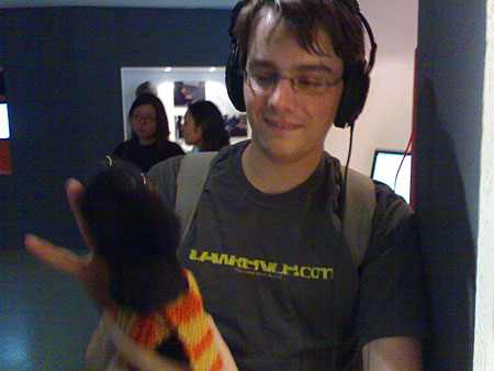
Singing Sock Puppets by Matthew Brown: Absolutely my favourite of the whole event – tiny glove puppets that look a bit gormless that sing in isotonic scales to jazz records, with the user choosing the pitch by how open the mouth is. It sounds dumb, but it’s the most fun I’ve had with a sock and some electronics in years. There’s some great stuff on Irvinebrown.com about this project, including a whole part of his portfolio dedicated to the singing puppet project complete with links to videos of prototypes: Durrel Bishop (1.5mb) and Brigitte Lelievre (2.3mb). He’s already been linked to by We Make Money Not Art, which is probably a good sign. Here’s a picture of Simon looking slightly over-playful with a puppet:

Bonsai Tree by Jennifer Chan: Bloody lovely this – it’s sort of a cube of rapidly manufacturable and easy to craft plastic material that you can take home and massively personalise to your whim. I imagine that some people would produce absolutely beautiful shapes, while others would product crap, but the concept alone is extremely beautiful. There’s more information about this project on jenniferchan.com – although unfortunately it’s all skanky frames so I can’t actually link to the specific project in question. This picture is from that site:

Liquid Orange by Graeme Davies: At the event I saw a whole bunch of videos of the experimental design work that went on around this concept, but I didn’t actually get to see the thing in action. The concept is really simple – something that you stick inside an orange that liquifies it from the inside giving you the freshest of orange juice with limited washing up:

Flying Fish Bowl and Bin Bag Bear by Shay Alkalay: Shay’s another one of the design crew who is poorly represented online, keeping his work hidden from the largest constituency of interested people in the world. And it’s a shame, because meeting him at the event he seemed a little more nervous than some of other designers but actually extrememly talented. The fish bowl was extraordinary and actually mentally challenging – a transparent ring-shaped object like a donut full of water attached to the wall rotates very slowly. It’s only about a third full of water, and industrial buildings cast in white plastic slowly move through the water, blowing bubbles aerating it. One side of the ring swells out a fair amount so that when the water reaches that point, the water level drops, meaning a gap in the inside of the ring that looks like it would cause all the water to pour out, just narrowly clips by without a problem. I found this completely fascinating – you sit there wondering about whether the fish is experiencing this as a pleasant experience and start thinking about cats sticking their paws in. An object that makes you try and contextualise it and think around it.
But it was his other project that I got completely excited about, and wish was in the world. And it’s easiest just to show you than to explain:

Anyway, there’s a bunch of other things I wish I could show you – including the 11 walking sticks that Jonathan Legge created out of random sticks of Hazel found in the forest, to Gen Suzuki’s extraordinarily simple but beautiful ‘oblique’ vases and chairs. Unfortunately none of these people had information on their sites that I could reference or nick. Definitely worth looking out for them though! In the meantime, all of this and more can be seen at the RCA until Sunday – and I’d be fascinated to hear what you lot liked or didn’t like about the event. I can recommend some of the shapes in the automotive design section. They’re extraordinary.


 Face it guys, there’s nothing new here that the


